Numbers are merciless: every day users receive twice as many emails as they send, which makes each email campaign a real battlefield for audience’s attention. This makes just an ordinary email with a special offer not enough anymore — well-elaborated design an absolute must to win your subscriber’s interest.
In our series of articles, we’ll figure out how to make up a visually stunning email step by step. As the first impression matters, we’ll kick off from headers — the first part a subscriber sees after email opening.
Before we start
To make things clear, let’s take a quick look at the main blocks of an email.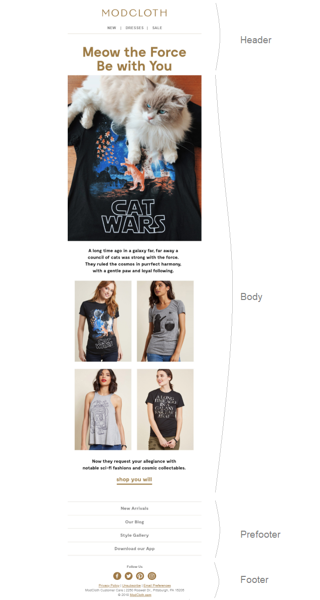
Header
It is the upper part of any email, which makes it the first block your subscribers see after opening your message. It usually contains a company’s name and logo, menu bar, contacts, or other useful external links. The header also includes a preheader, or preview text. It’s a piece of text pulled in from the email body and displayed next to the subject line.
Body
It is the biggest and the most informative part of any email. The body usually contains elements to leverage the conversions, which all email campaigns are created for. These elements are core call to action (CTA), images of promoted items and special offers.
Footer
The last, but not the least, as they say. This block also contains a prefooter, which together make a crucial element not only for compliance reasons but also for customer-experience purposes. It’s often where your subscribers look for details about your company, manage their email preferences, or unsubscribe.
Now that we have touched upon all elements, let’s start with the first one. If you want your subscribers to see the unique offers inside your email, you have to make them open it — with a cool preheader.
Preheader
Preview text is displayed right after the subject line. In other words, this is something that users see while just checking their inbox.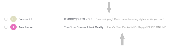
Smart preheader text is just as game-changing as a subject line because it summarizes your email’s content and keeps your emails out of the spam folders. Sounds promising, doesn’t it? But reality bites. Sometimes the subject line is either followed by default text from the email body or, together with the preheader, doesn’t make much sense.
According to MarketingExperiments, a preheader improves open rates by 30% and click rates by 17%. These are the results every email marketer would love to achieve, so let’s answer one simple question: What makes your preheader a good one?
- Its length. It is desirable to keep your preheader text to between 40-50 characters to ensure proper display across different devices.
- Its informativity. Subscribers have to fish out as much as possible while just scanning their inbox.
- Its design. Yes, even a preheader has to be appealing. No, going all caps isn’t the only thing you can do to come into notice.
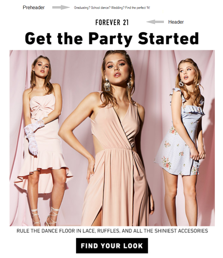
Check out our tips into preheaders and some examples for clarity.
Five email preheader ideas
- Use the preview text as an extension of your subject line to give your customers a better insight into the email.

- Add a call to action to get a better response.

- Make an offer users can’t resist or wouldn’t want to miss. Fear of missing out never gets old.

- Go personal. Including subscribers’ first name, or their location, for example, not only adds a feeling of rapport but also improves email open rates.

- Make the preheader stand out. When the words are not enough, it’s time for emoji.
 Don’t forget to carry out an A/B test to find the preheader which will bring you desirable opens. Now it’s high time to talk about the header itself.
Header
Bingo, your email got opened and a user is skimming through it. Now you should make your email work for you. It can either catch or fend off subscribers’ interest, so giving it some thought won’t hurt. A typical header consists of
- company’s logo and name;
- menu bar;
- social media buttons;
- contact info;
- call to action.
The width of the header is usually 600-700 px due to template dimensions, while its height varies depending on the amount and size of its elements.
Unlike header’s size, its design can’t be as clearly defined. But that’s really great as you can always design a header which will match your corporate style and highlight your brand identity.
Three tips to create a catchy email header
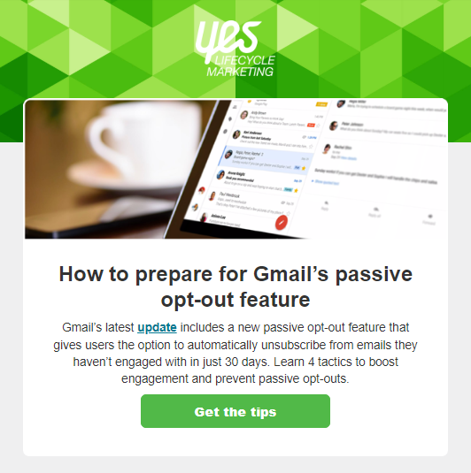
1. Color up! Nothing to explain: colors always turn heads. Apart from that, they set the mood and grab attention, if used in moderation of course.
Here’s a nice example of a newsletter by Yes Lifecycle Marketing, an Infogroup company. Their header brightens up the whole email and makes it look more lively.
2. Play with fonts. Combine different fonts to give your header some contrast.
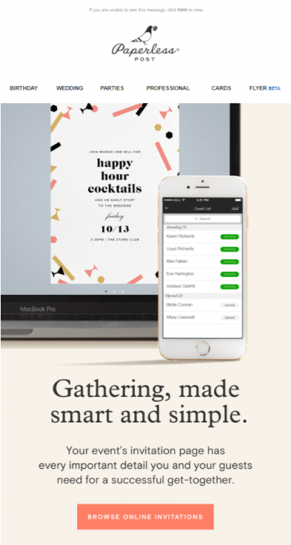
Paperless Post, an online and printed stationery manufacturer, designed a minimalistic header with their logo and company name, written in contrasting fonts. Eventually, they’ve got a neat header that doesn’t distract from the email’s actual message.
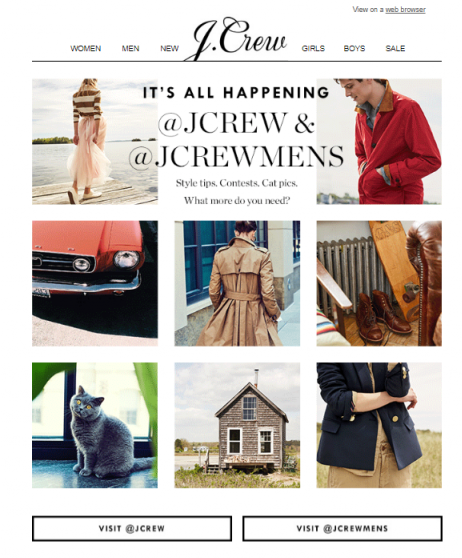
J.Crew, in turn, places their logo in the menu bar and makes it stick out by using a different font.
3. Experiment with images. Yes, a header in each email is a must, but who said it should stay identical from email to email? Restyling the header will make your emails look fresh and renewed.
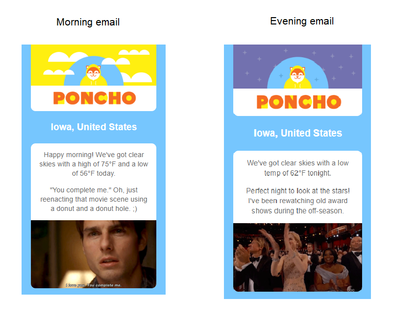
For example, Poncho, a weather forecaster, changes headers depending on the time of the day, leaving the same background color. This brings novelty and diversity into their emails.
Placing a photo into a header is another way to grab subscribers’ eyes.
Pearson, an educational service, regularly invites subscribers to their workshops. You can see one of such invitational emails below. To make their message more welcoming, they put a photo of an actual speaker in the header. The subscribers might not be acquainted with the speaker, but his photo makes a good impression and wins credibility.

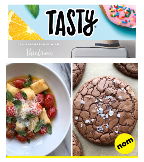
Check out a header in one of the Buzzfeed’s emails. The brand used ordinary images of food and a contrasting background for the header not to look boring.
As you now see, crafting a well-balanced header may be tricky, but possible and even creative. Use our tips to make it aesthetic and attention-grabbing. Stay tuned for our next article as we’ll talk about the most informative block — email body.