A well-functioning subscription form is an important aspect of email marketing. Especially when it concerns the e-commerce area, where email mailings prompted 35% of sales in 2016.
We will show how American online stores attract newsletter subscribers and tell you how to create the same subscription forms for free without a programmer.
Embedded subscription form
A subscription form is typically placed on a website either above the footer or in the sidebar. It almost always repeats the design of the site and does not attract attention with anything flashy.
The following examples show you the embedded style.
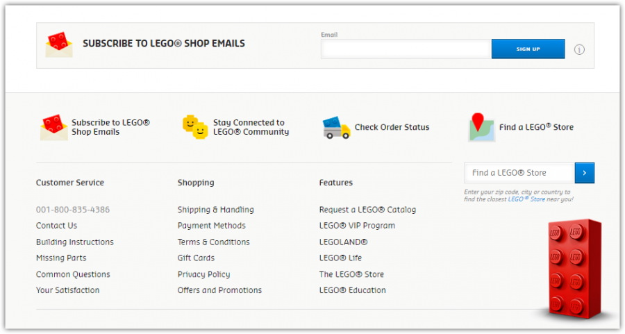
Lego
The Lego subscription form is embedded in the footer of the site and contains only a field for entering the email address and a sign-up button. The form is located above important information about the shop, and this increases the likelihood that the user will notice it.
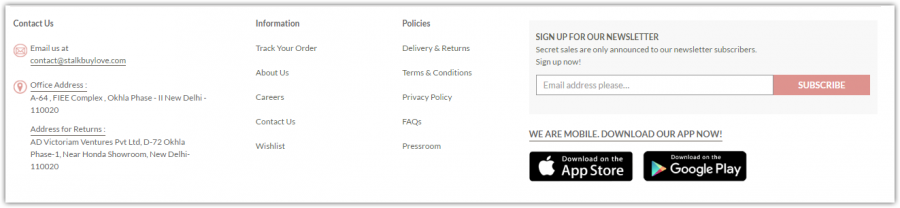
Stalkbuylove
The form of this site has quite an interesting use of attraction marketing with the statement — “Secret sales are only announced to our newsletter subscribers.” While leaving an email, the future subscriber will feel as if he is special.
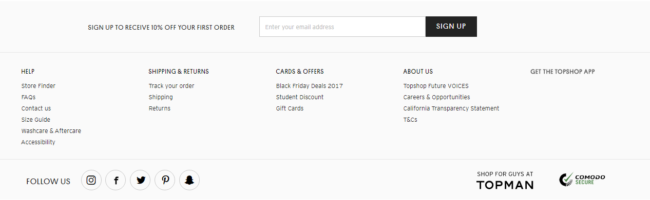
TopShop
TopShop has a simple embedded form with a field for an email and a sign-up button to click. It repeats the design of the site and has no call to action.
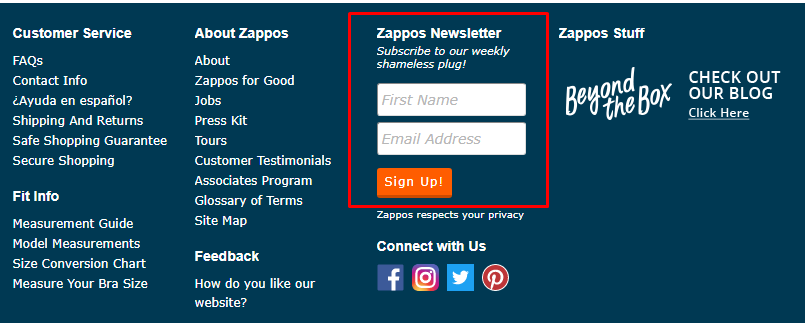
Zappos
Using almost the same subscription form, Zappos has an embedded footer with two fields: one for email address and one for the user’s name. Most likely, while sending their newsletter, Zappos will use the subscriber’s name for personalization.
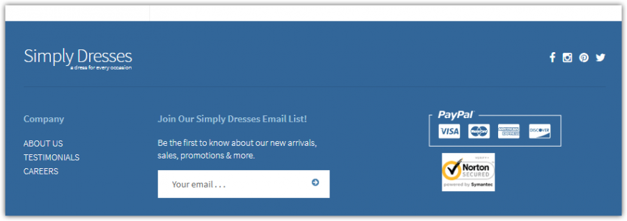
Simply Dresses
This website’s subscription form has a call to action, one field for an email address, no button and the same design as the whole site. The form is located next to the payment method options, and this increases the likelihood that the user will notice it.
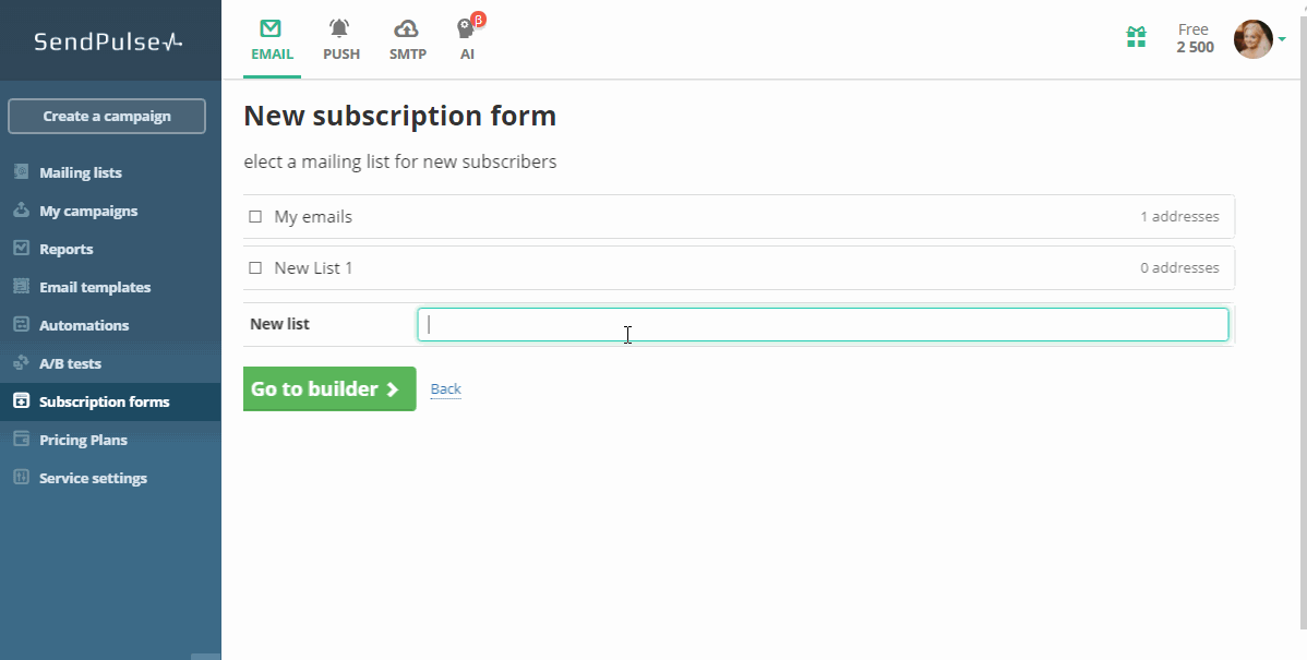
How to create an embedded subscription form in SendPulse
Vertical:
Horizontal:

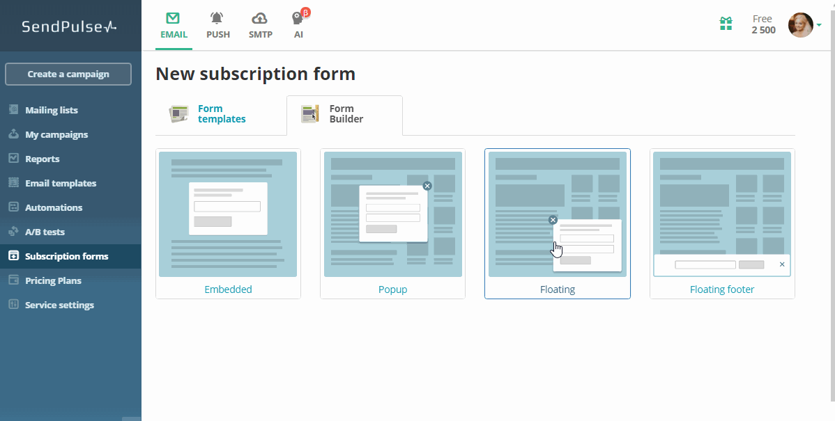
Popup
This style of subscription form appears according to some conditions:
- On page load
- When scrolling to a part of the page
- When the cursor leaves the page
Check out the following examples of companies using a popup subscription form.
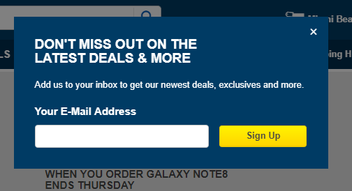
BestBuy
This promotional offer with automatic subscription appeared after 10 seconds of staying on the site. Exclusive offers are an excellent motivation to subscribe.
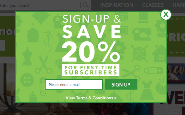
Joann.com
In four seconds after the site opens, a pop-up appears with a coupon for a 20% discount.
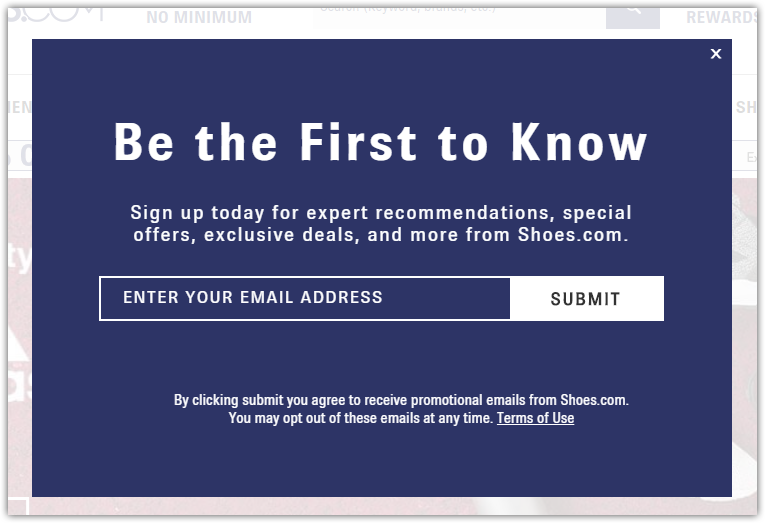
Shoes.com
Pay attention to their call to action. This form consists not only of the email field but also the call, which guarantees expert recommendations, special offers, exclusive deals and more. This is a psychological technique in copywriting, which increases the click-through-rate, or CTR.
Сreate a popup in SendPulse
Floating subscription form
A floating subscription form is often located in the bottom corner of a site, but this is not a fixed rule. When the page is scrolled down, the form does not move.
How to create a floating subscription form in SendPulse
Improve your subscription form with these simple steps:
- The fewer the fields, the better. Do not force the user to fill out fields that are not important to the subscription stage. If you need additional information for segmentation, use radio buttons.
- Offer bonuses and explain the benefits. It can be a one-time or permanent discount, a gift, membership in a club with privileges, or priority service.
- Set the expectation for mailings. The user must understand what exactly he subscribes to and how often he will get the mailing. For example: “Once a week we will send offers with discounts,” or “Every Thursday you will find a selection of new products from our store.”
- Consider design. It is recommended that the built-in subscription form should repeat the design of the site and not stand out against the general design. If the goal is to attract attention, which is more relevant for pop-ups, then make an emphasis on design.
- The text on the button. Much more attention will be paid to the phrase “Get a discount” or “Receive a gift” than “Subscribe.”
- Do not correct user entries. If a user wants to write a name first, and then a surname — let him. Do not make rigid rules for filling in fields.
- Write clear error message text. Specify what the user entered incorrectly, and do not force them to guess what went wrong. For example: “You did not enter an email address,” “Your email address is missing the @ symbol,” or “Date of birth formatting is 01.31.2000.”
Simplicity and clarity of the subscription process will increase the chances of receiving a user’s email address. But it’s also important not to forget that “Leave me your address” is not enough anymore — people need to be motivated and told what benefit they will get as a result. To do this successfully, use the techniques given above, and the technical side will take care of the mailing service.
In SendPulse you can create embedded, floating subscription forms and pop-ups in a convenient editor without the need for a programmer.