Every landing page is composed of certain building blocks. You need to know them all to create the most convincing pages and never risk having a leaky sales funnel. Once you’ve learned the basics, you will be able to experiment with these blocks. In this article, we’ll take a look at the main elements of a good landing page and give you some pointers on laying out your page’s copy and design.
What is the anatomy of a landing page?
All landing pages are a type of post-click page aimed at urging visitors to make a decision.
You explain all the benefits and perks of your offer and invite users to take some desired action. Since it’s an extremely important stage of the funnel, there shouldn’t be any distractions such as navigation bars or links to other pages.
A solid landing page structure helps you tell the whole story. Without it, leads will eventually bounce off because your page doesn’t look trustworthy or persuasive. Remember, you want your visitors to convert — make sure you give them enough reasons to do just that.
Here are the main landing page elements you need to think over:
- a unique offer;
- engaging visual content;
- sharp and concise body copy;
- the benefits of your offer;
- features;
- social proof;
- lead form and clear call to action.
We’ll explain the meaning of these elements, but first, let us say right away that your offer should be the essence of your whole landing page. Metaphorically speaking, it’s not just a vanilla icing — it’s the whole cake. You can communicate your proposition using several components of a landing page, and we’ll describe how.
The key elements of a landing page
Here, you’ll find more elements than we listed earlier. How come? Well, not all of them are mandatory, and you have the last say. For example, if your product is plain and low-margin, you may want to skip a FAQ altogether. We recommend including all these blocks in your landing page structure anyway — just make them simple and straight to the point.
Headline
Every offer boils down to a single sentence — take yours and use it as a headline. You can make it bold, expressive, or brief, just don’t dilute the core idea behind it with unnecessary wording. What you can do is introduce a fresh solution, pinpoint an annoying problem everybody faces, or tap into people’s desire for quick fixes. Add a small supporting copy to provide details and back up your claim.
Whereby is a service that makes remote collaboration more accessible. And this is the first thing visitors learn when they land on their page:
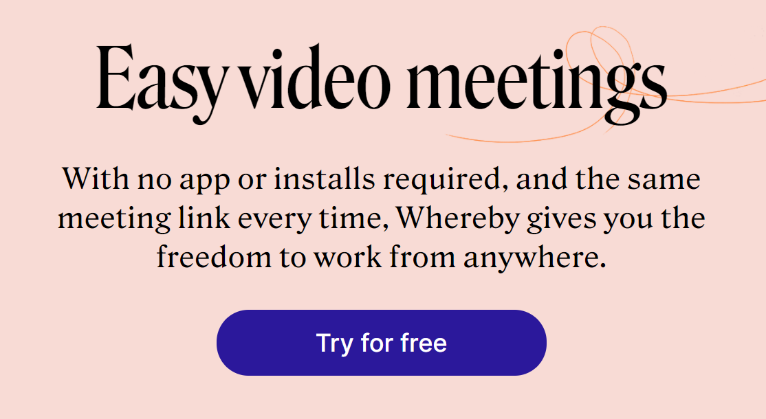 Whereby uses simple headlines and supporting texts
You can make your headline more emotional and appeal to users’ pain points, as Perspective API does:
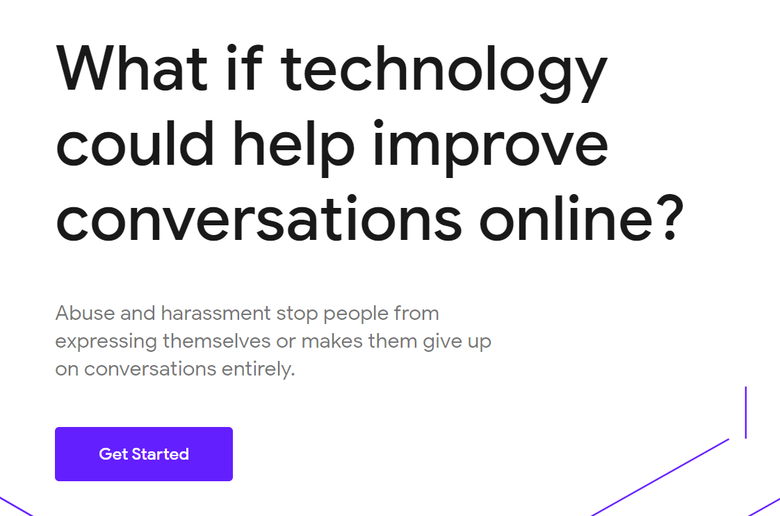 Perspective API encourages users to make their digital space safer with their headline
From a designer’s point of view, it’s important to make your headline one of the main focal points. Use elegant font pairings because beautiful typography helps deliver the message and establish the mood. Choose contrasting font sizes for your headline and supporting text, for example, 30px and 15px.
Body copy
The best practice is to speak your audience’s language. Make paragraphs short — two or three sentences each. Feel free to use numbered lists and bullet points to separate your copy into easily digestible chunks. The main rule is to not make your leads need to wade through long reads to get the information they need.
Keep your landing page copy benefit-centric by talking more about the positive impact of your product and less about the product itself. What is your special sauce? How is your product going to make someone’s life easier? Put it in a nutshell. Here is an example:
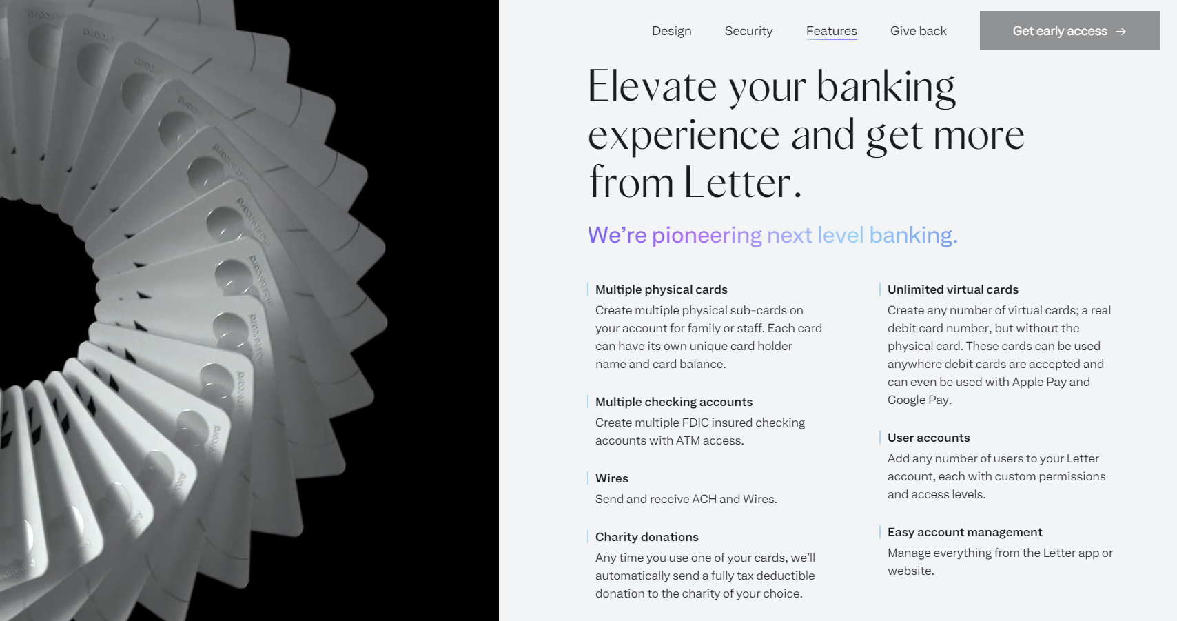 Letter is an exclusive banking platform, and their landing page copy explains how it works
Pay attention to your typography choices. Your fonts should be attractive but also legible. Use different line spacing and letter spacing for different typefaces. Avoid using 6px font size and light grey text for body copy — they may look stylish in your mockups, but they make your text harder to read.
Images, animation, or video
Use engaging content that makes people dream. You can convey certain emotions or create a metaphor by using relevant, high-quality images and animations. Never use images just to fill in the blank.
For a complex product, you can use unique abstract illustrations:
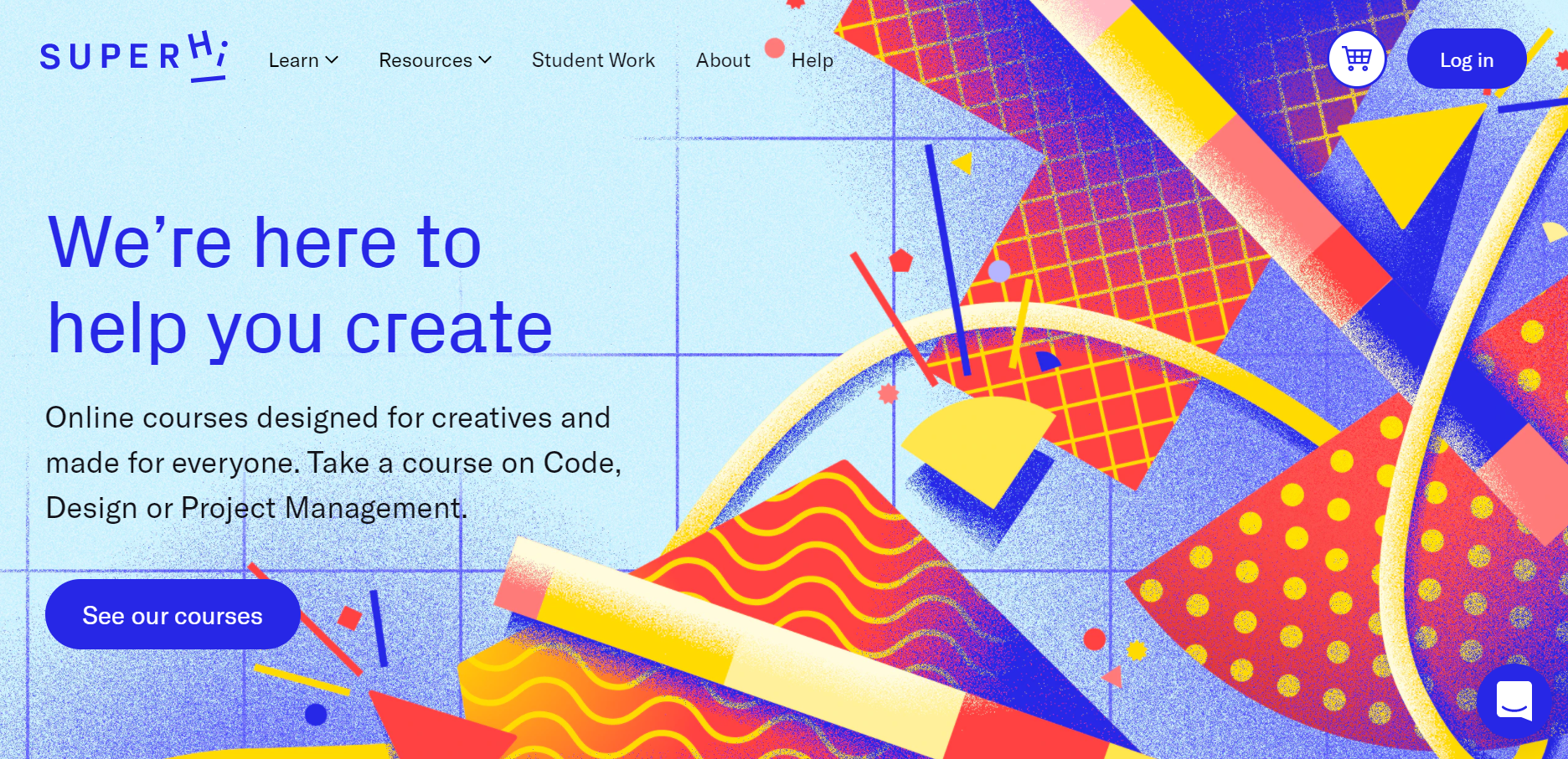 Superhi uses a bright abstract graphic on their landing page
As we’ve mentioned before, it’s also helpful to add metaphorical illustrations if you’re dealing with highly technical products:
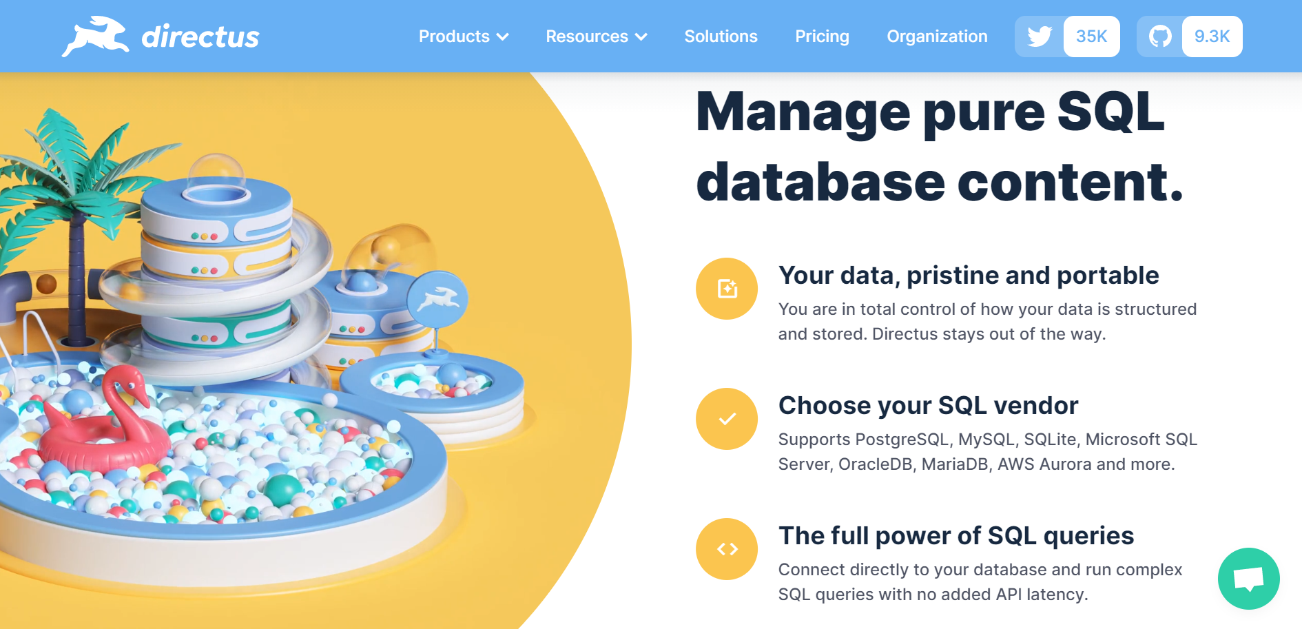 Directus uses pictures of colorful slides and ball pits to visualize the distribution of data
If you sell physical products or offline services, use product photos and pictures of your real happy customers to convey the feeling:
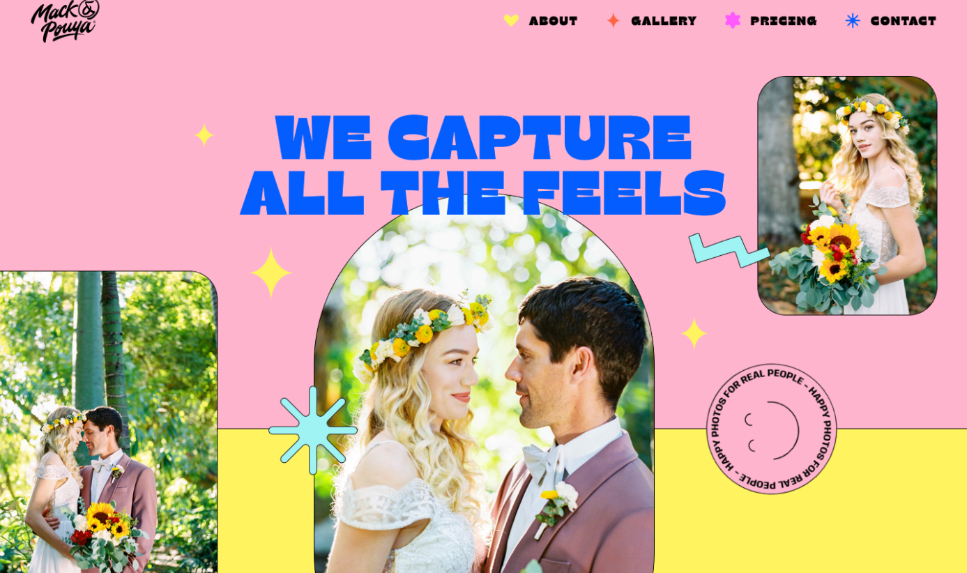 Mack and Pouya offer wedding photography and use their landing page images to inspire visitors
Sometimes you want to engage users right away, and images are not enough. This is especially true for experiential services and tech companies. They often use video to explain their offer or showcase previous work:
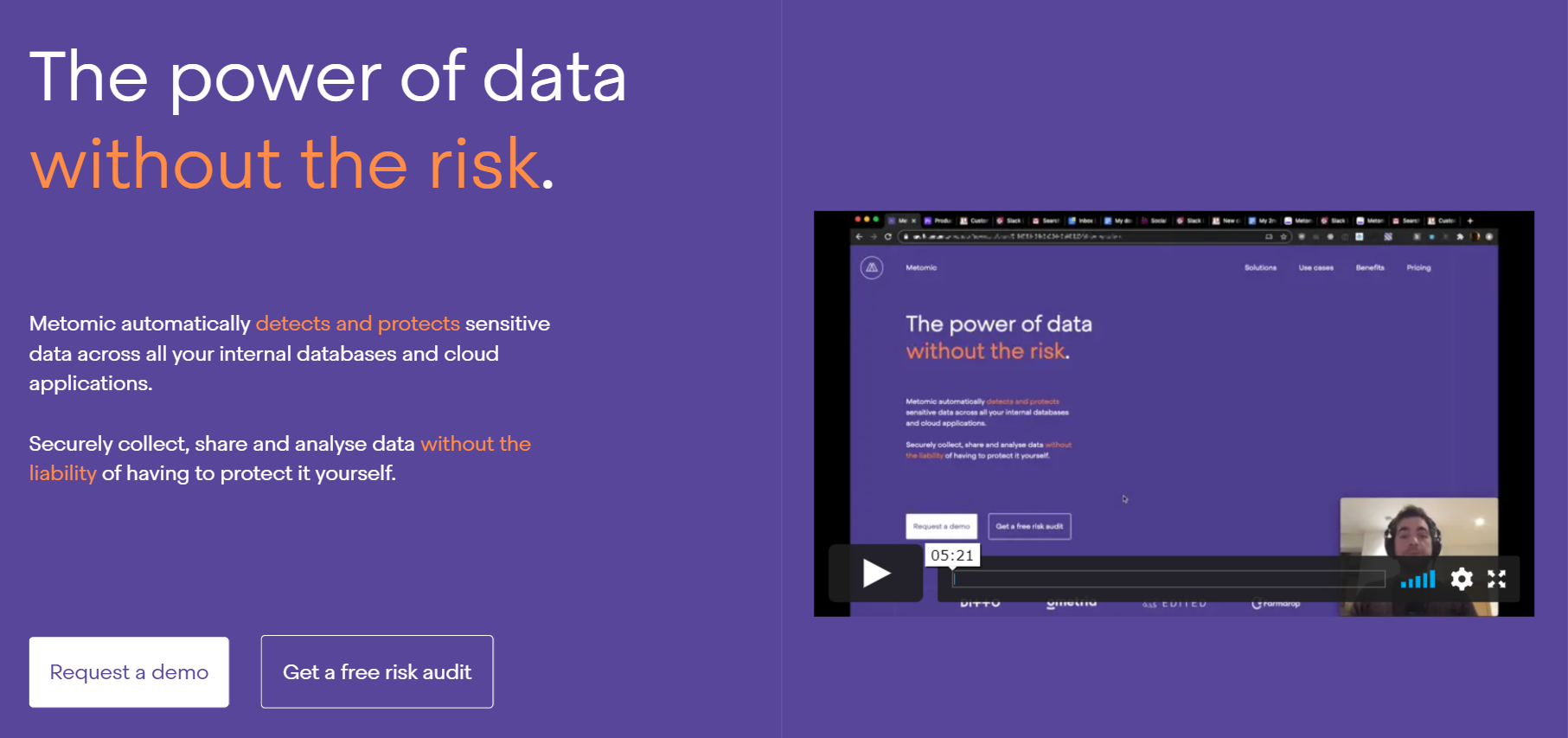 Metomic prefers talking to users directly with the help of videos
Remember that using stereotypical stock photos is frowned upon. It’s better to make your visuals memorable and never compromise on authenticity.
Most of the time, you want to collect some data from your leads to start a conversation and understand your audience better. This valuable information can be as simple as the user’s email address and job title.
You can create a subscription form using our simple and intuitive
form builder!
Keep your lead form minimalistic, intuitive, and add some supporting copy to it:
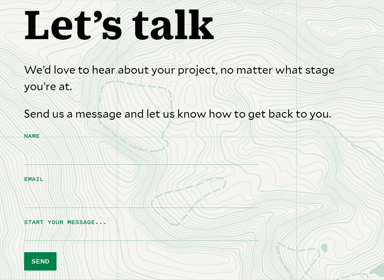 Faculty is a design studio using lead forms to convert visitors into customers
Some marketers insist you should keep it above the fold, at the top of your landing page. But it’s totally up to you: split test it and find out what works better for your offer.
This is what you usually see above the fold and in the footer of any good landing page. The thinking goes, you need to pitch your product and make a purchase offer, then describe its benefits in detail and finish with an even more convincing call to action.
Some users need time to read about all the features and explore the benefits of your offer.
And some users might be ready to convert from the moment they landed on your page — you need to give them this option too, so having two or even three CTA buttons across the page is fine.
This is what a CTA button usually looks like:
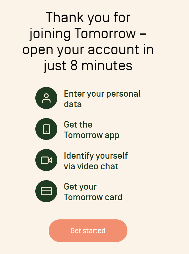 Tomorrow is a banking system that helps users get their new card in a few minutes
Use active verbs and contrasting colors when designing your CTA button. It should contain five or fewer words and be surrounded by some negative space to focus the user’s attention. Don’t forget to add click triggers like “No credit card required” or “Money-back guarantee.” And, of course, give it some supporting copy.
Countdown timer
Old but gold, this trick adds scarcity to your offer, and people hate to miss out on great deals. But an old-school countdown timer looks and feels a bit suspicious, not to say fraudulent. By now, many people already know that marketers use an evergreen timer that counts down from the moment a visitor enters their page. And users’ trust plummets.
You can outsmart your competitors and add some scarcity using much more subtle tools. For example, show your visitors that there are only a few free spots left, and they need to act quickly:
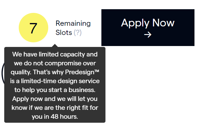 Predesign studio shows the number of free slots next to their CTA button to create urgency
Of course, you can still use a typical countdown timer when there is a real limited offer, for example, on Black Friday.
Social proof
The anatomy of a landing page is important, but it’s not what drives the sales. Before committing to anything, people want to know who already uses your product and what their experience has been. To gain trust, use social proof such as reviews, testimonials, and videos. Ideally, social proof should support your marketing claims and demonstrate that you deliver on your promises.
It’ll be helpful for your leads to find out which problems your product has already solved. Even short feedback can be informative:
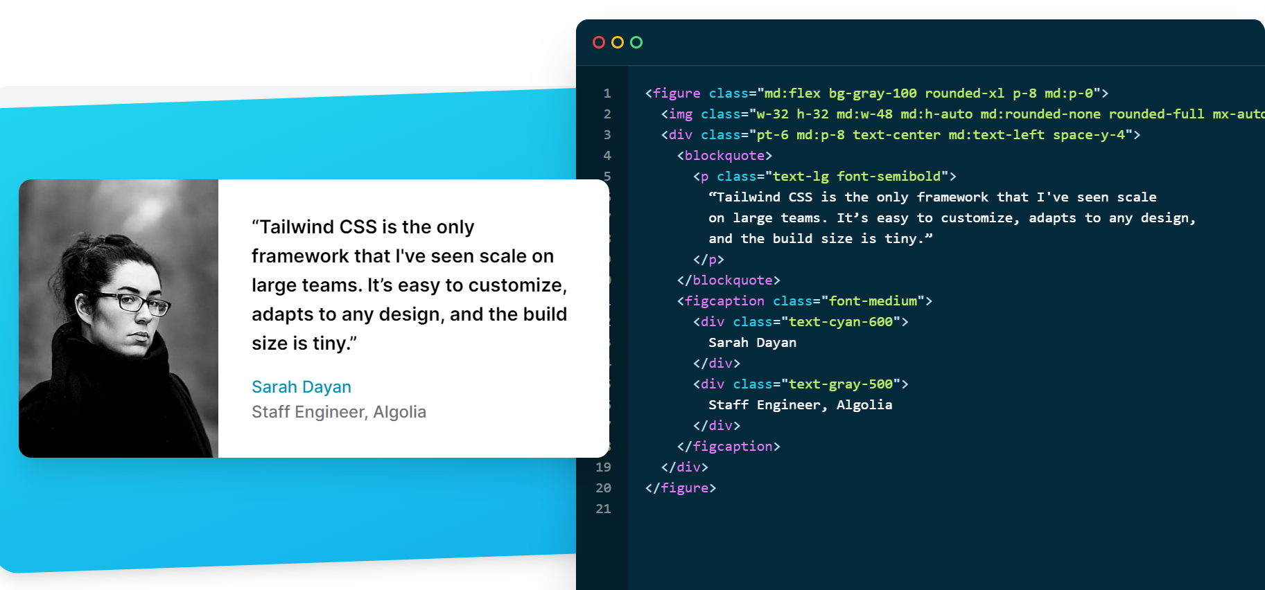 Tailwind CSS shows real testimonials from their clients
We can’t emphasize enough how important it is to use real photos and actual testimonials from your customers. Overused and easily recognizable stock photos are absolute trust-killers. Ask your clients if you can use their actual photos instead.
Benefits
What impact does your product create? In this block, describe all the positive changes that your solution brings. For example, Elementor helps designers to turn chaos into order when it comes to their work processes, and its landing page describes the exact benefits of the tool:
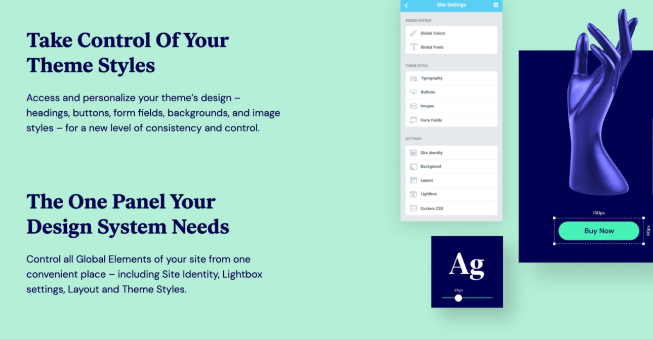 Elementor shows designers how they can work more efficiently
Use bullet points or simple paragraphs to list the benefits — it’ll make them more catchy and readable. Add some visuals as well to make this part of the page more captivating.
Features
Out of all the landing page elements, this one is the most product-oriented. Finally, you can go into detail here and describe the product itself. Emphasize the features that make it truly unique or innovative. List all specific qualities of your product or service:
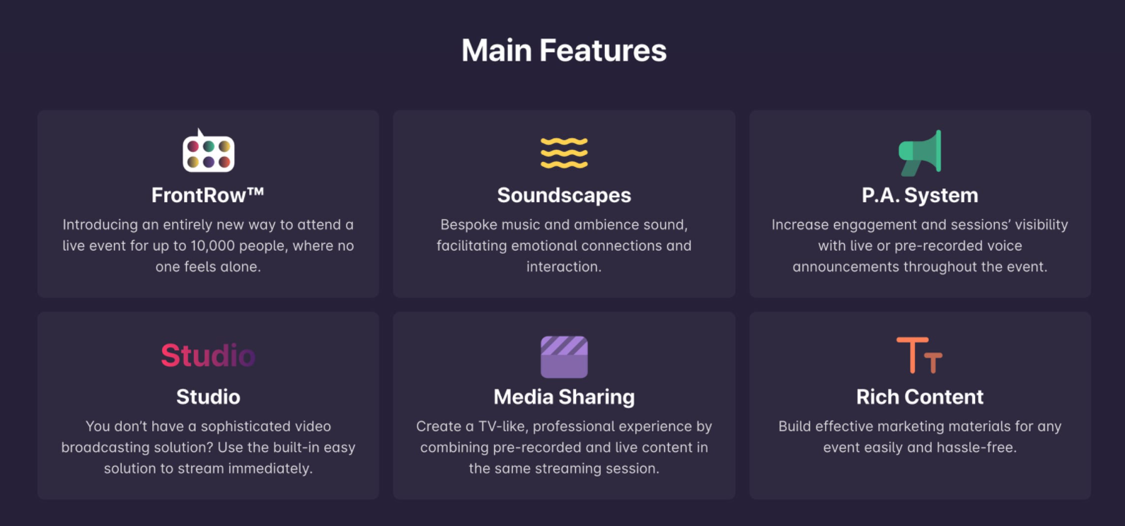 Hypersay Events explains how users can make use of all their features
Do not overwhelm users with a list of 20 features and long descriptions — keep it simple and informative, and don’t forget to use more active verbs.
FAQ
This is an important block where you can answer popular questions, dismantle objections, and respond to your clients’ fears. First of all, it will save you some resources. It will also build trust because people will see that you care about their positive experience.
Squarespace, for example, provides answers to the most frequently asked questions and also suggests using their personalized support:
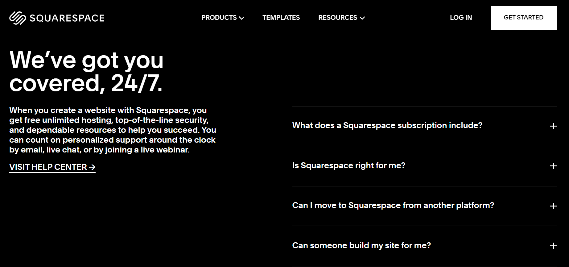 Squarespace using FAQ on its landing page
Base your FAQs on real feedback and customer support data so that newcomers can find the most relevant answers and overcome their fears.
The footer on your post-click landing page shouldn’t be a typical heavy footer stuffed with links. It doesn’t need a sitemap or any related links except, maybe, your contact information (we’ll get to that in a second). What you want is to get rid of distractions and add a high-converting CTA button:
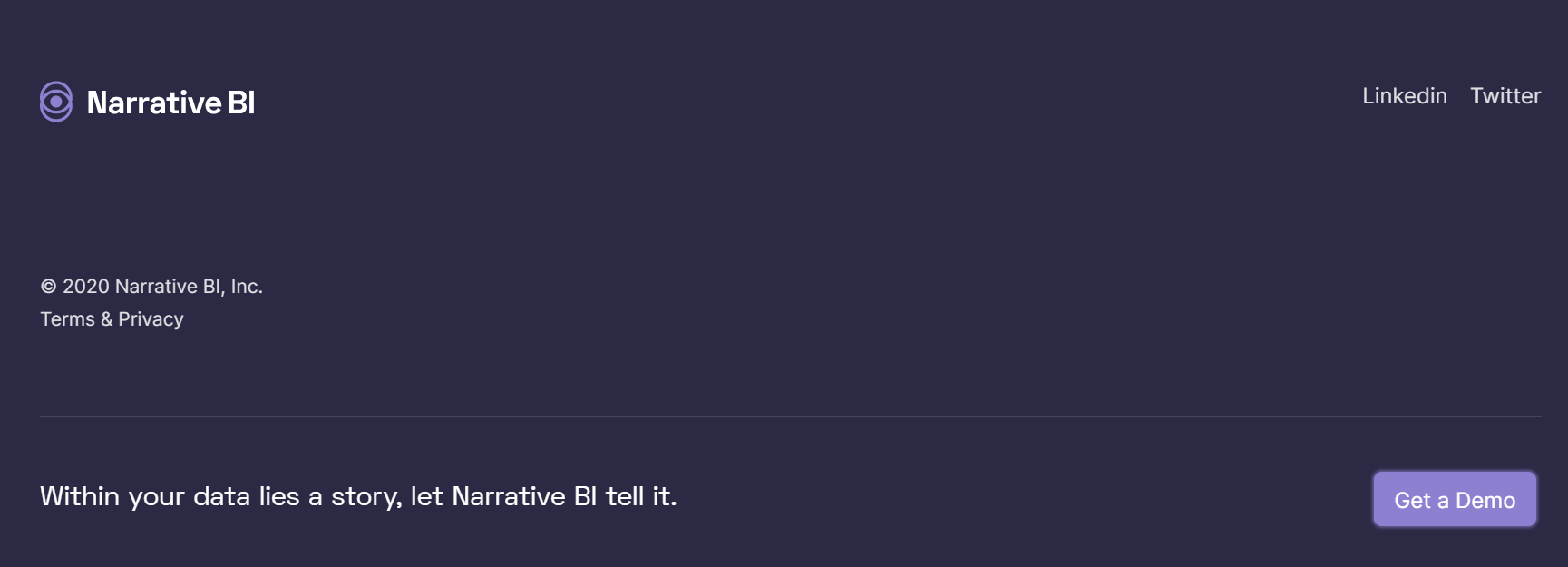 Narrative BI repeats their CTA throughout the whole landing page
Sometimes, especially if your offer is premium or complex, your visitors will want to talk to an expert from your company first. The footer is a good place to add a contact form to fill out. You can keep some links to your social media pages since they are also networking platforms.
Ready for more?
As you see, all of these landing page elements help unfold your offer and guide users through the page until they finally convert. A low bounce rate is a sign that you’ve mastered the anatomy of a landing page. What you’re going to need next is the tool to nurture your leads and stay connected with your customers. SendPulse can do both and much more — it’s great for sending automated emails and creating chatbots for Facebook and Telegram. You can also use our service to send web push notifications and SMS to your clients!