A call to action (CTA) is an interactive element with the goal of motivating users to complete a specific action based on its message (buy, contact, subscribe, download, etc.). Marketers use them both on websites and in email campaigns to increase their ROI.
In this video, Anya, a marketer at SendPulse, shares the most effective and proven CTAs that'll boost your conversions.
Why Do You Need a Call to Action?
Both websites and emails benefit from a proper call to action to impress and motivate users. No matter how good your product or service is, it won’t create demand on its own. Use a powerful CTA, either in the form of a button, banner, pop-up, or something else.
The main idea is to convert users into customers and generate more traffic. You need CTAs to turn your website traffic into clients and increase your revenue from email marketing campaigns. The idea is to motivate users to click and use your business offer. It has to sound convincing to motivate the target audience.
If you don’t know how to make your CTAs stand out, SendPulse is here to help. Our service provides email A/B testing to assist you in detecting the most effective call-to-action for your promotional campaigns.
How to Write a Killer Call to Action
- Choose a product or service to promote
- Set goals
- Decide on the type of CTA
- Decide where to place your CTA
Don’t underestimate the power that a well crafted CTA has to increase the profitability of your business. According to Medium, powerful CTAs significantly improve conversion rates. Effective personalization helps you increase this metric by 202% while urgency in your CTAs contributes to reaching an impressive 332%.
Imagine that you are taking your user by the hand and leading them through to the buying process. Here is a brief guide to creating a powerful CTA step-by-step:
- Choose a product or service to promote. Some people try to apply the same CTA to different products or services at the same time. It is critical to target your audience properly. Develop a diverse approach for different landing pages; CTAs are not a one size fits all solution. If you sell different products, create different CTAs for every landing page. This way, you’ll manage to approach each client properly.
- Set goals. Think about the primary business goals that you would like to meet with your call to action and make a list prioritizing the targets. For instance, if you wish to build a business relationship, it might be a good idea to use something like “Send me info.” Download buttons work well for lead generation because they provide users with an incentive.
- Decide on the type of CTA. The most common types of calls to action are buying buttons, info collection forms, subscription signups, social media share buttons, help, and specific words like “Read more” or “Try it now.” Your choice depends on the page you’re going to place it as well as the customer lifecycle stage. Provide leads and loyal clients with different offers to meet their needs. For example, a new user needs more info about your brand before they pay.
- Decide where to place your CTA. The location of your CTA determines how much traffic it gets. Common places for CTAs on a website include the beginning of a page, after a blog post, in an email, on a welcome gate, and the sidebar. Once again, it's a good idea to test which place gets the most conversions. Try to come up with calls-to-action for each of these locations and watch your analytics closely.
Writing a Call to Action
So now that you know that CTAs are vital to convert your users into customers let’s look at some ideas for writing one. Since CTAs are a key component of your effective content marketing strategy, make sure that you look at your other content to understand what kind of information is important to your users. Your choice of words depends on your industry and target audience, so understanding what your users care about is step one.
Because of various preferences, demographics, cultures, ages, and other factors, different people perceive diverse words in their unique way. First, try all of the words and ideas listed below until A/B testing shows which of them works best.
- Get started — common CTA, waste no more time — let’s start the journey;
- Sign up for free — you obtain some benefits right from the registration process;
- Create an account — at least, this person will become your user, if not a customer;
- View demo — people always appreciate having an example to look at;
- Contact us — show your users that they can get support from you directly;
- Learn more — let users dig deeper into the details if they want;
- Show now — once again, there is no reason to wait — take action and don’t postpone the shopping process;
- Discover or find out — these words work perfectly for titles and headings;
- Get X% off — show them how much they can save with your service;
- Add to bag — allows users to continue shopping without fearing to lose important information such as chosen items;
- Schedule or book something — warn users that time is limited, and they should choose one ASAP;
- New X — let them know that they may be the first to try something new;
- Subscribe — this sounds less pushy than “buy” or “pay.”
Keep in mind that a compelling CTA will resonate with your users. Think about other words and phrases, but make sure they are relevant to your offer and audience.
Best Practices and Tips to Design a Perfect CTA Button
- Focus on the reward
- Make it simple
- Stress that it’s free
- Personalize the messages
- Let clients choose
- Play with colors and spacing
- Put your message above the fold
- Offer the users a trial or demo first
- Use an original design and stress the product's simplicity
- Make it short and clear
- Highlight basic features
- Add a quick sign-up form
A CTA button is an interactive element of the UI that motivates users to become customers. These buttons are one of the most powerful and wide-spread types of CTA, so learning to design a great one will benefit you immensely.
Focus on the reward
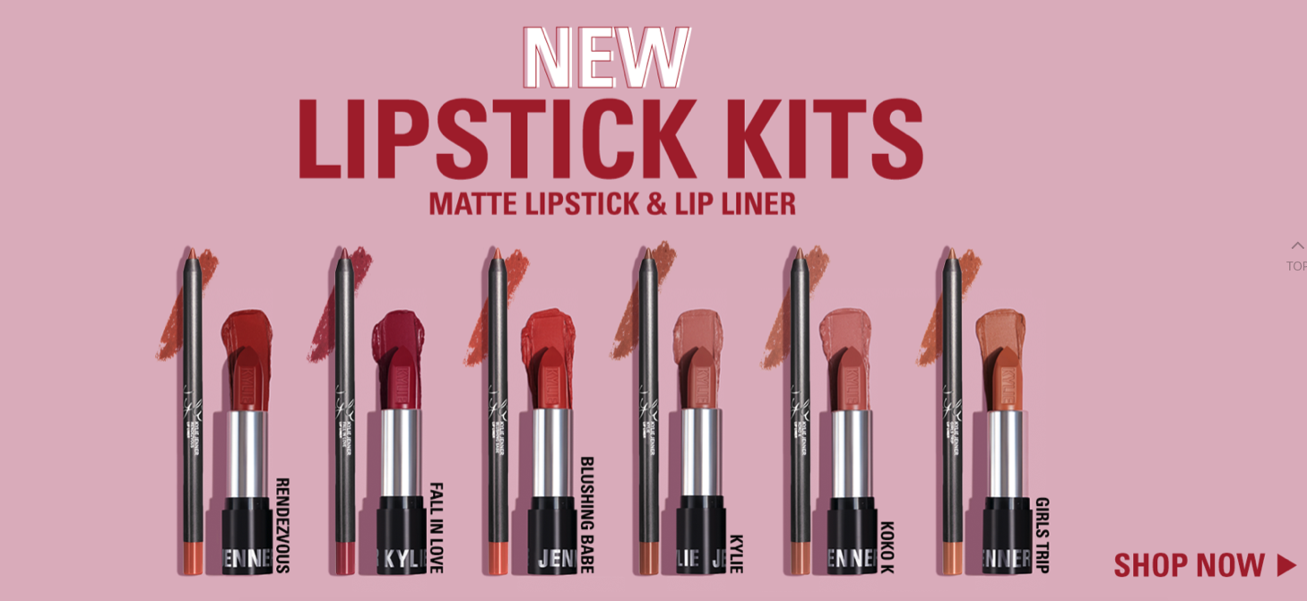
To guarantee a rewarding experience to your clients, show them the value of your offer by using a proper CTA. People hate waiting in lines, so stress that they can get something immediately by clicking your CTA. Reward users for taking action. For instance, Kylie Cosmetics always adds the word “now” to its banners and CTA buttons to stress that a user can start their education immediately.
Make it simple
Do not try to reinvent the wheel when creating a CTA. Long texts don’t look pretty on a button, and all the wide-spread phrases motivating people to take action are overused. Sometimes, it is enough to insert something like “Purchase” or “Download” – after all, you should already be explaining the details in the rest of your content.
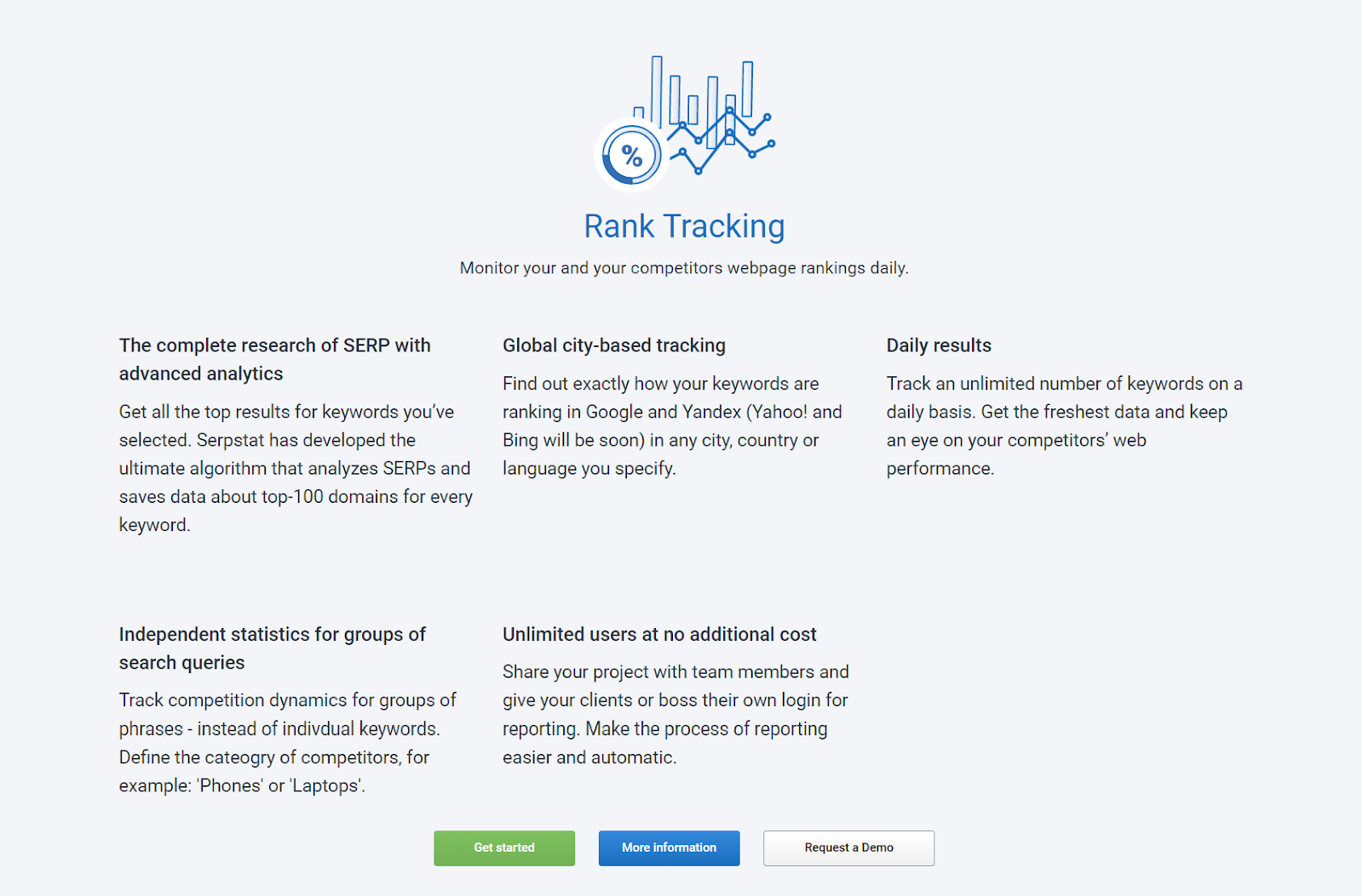
Serpstat provides users with a detailed description of their product and invites users not only to start using their product but also to request a demo or more information.
Stress that it’s free
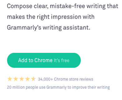
Let’s say that your service has some freebies to offer, or a trial before paying for the full features. Even if your service is not totally free, you should mention that users can enjoy a free trial to see if the quality is satisfactory. Grammarly stresses that users can add their application to Chrome free of charge.
Personalize the messages
Add the name of your recipient at the beginning of the message. It will show your personalized approach – everyone likes feeling special. For instance, Design Hill stresses that they create and customize clothes for you.

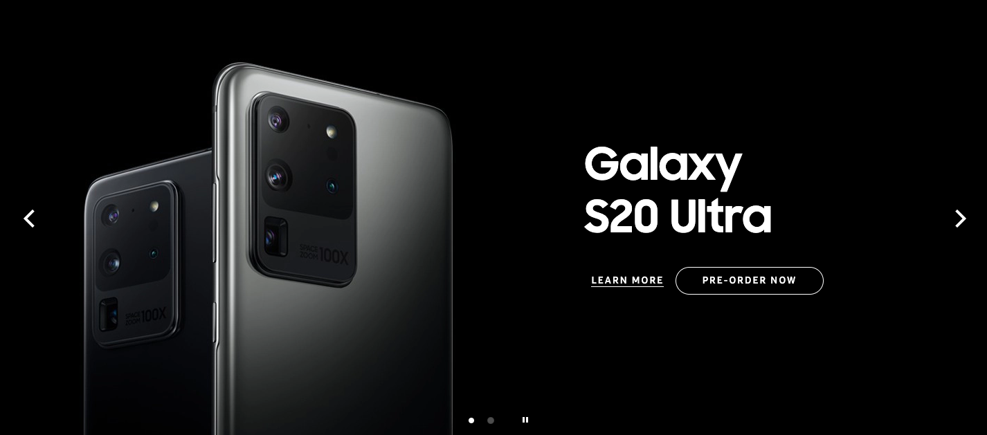
There is another way to make your customers feel special. Say that you plan to release a new product or upgrade an existing service by adding some exciting features. Do what Samsung does – invite subscribers to pre-order your product and become one of the first lucky owners. People love exclusive deals.
Let clients choose
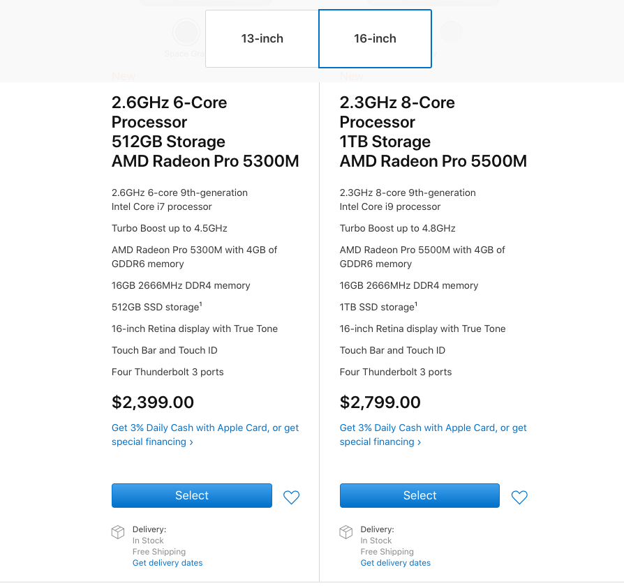
Games with many options that allow you to customize your character are more successful than other games. Why? People love having choices and making them. They feel bored when there is only a single option. Have a look at Apple with its MacBooks – they kindly ask users to specify their preferred size showing that there is something for everyone, and a customer is the one to decide.
Play with colors and spacing
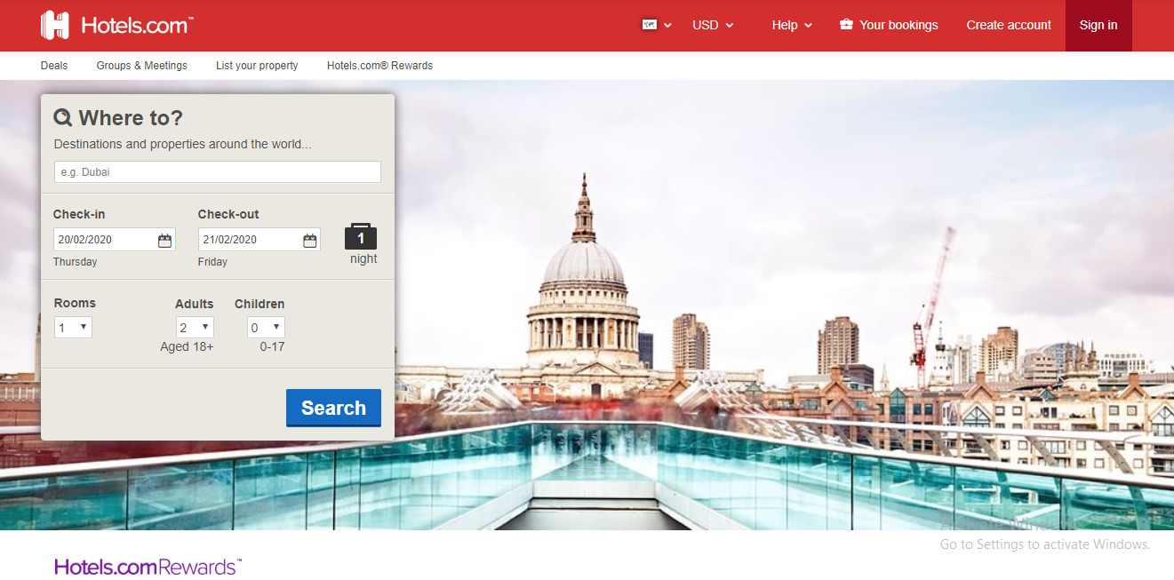
You may want to surround a call to action with a whole lot of nothing. This way, you will make sure that it is the only thing that users notice. A better idea might be simply to make the CTA button bigger and use an inviting color like blue or green. A red button may scare customers off.
Hotels.com made their search button noticeable for everyone.
Put your message above the fold
If your homepage has a lot of content, put the CTA above the fold. Try to make it easily visible immediately after entering the site. Expedia placed a form for their clients with a CTA button at the very top of their main page.
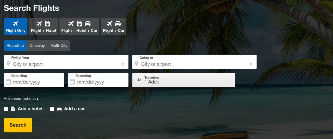
They can be sure that their clients will first enter their details and book a trip instead of reading information about the company or content lower on the page. Remember: people usually know what they are looking for and why, so this type of content only requires you to fill the pages with content for SEO purposes.
Offer the users a trial or demo first
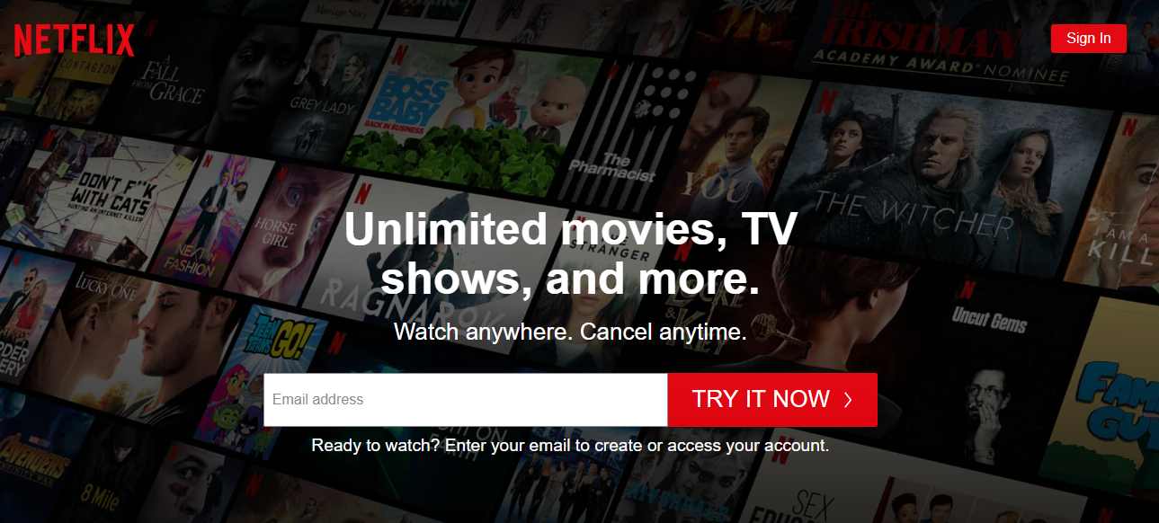
Many users don’t want to pay for long-term subscriptions. They prefer being able to cancel a service whenever they want. It makes sense: after all, where is the guarantee that you’ll enjoy the content and services offered by the company?
Netflix prevents its users from headaches – by offering its service for one month at no charge, and users can cancel their subscription at any time. Of course, not many people decide to quit using this popular brand. Thus, there is nothing to fear.
Use an original design and stress the product's simplicity
Presentations were, are, and always will be an effective way to share ideas. Prezi, a great online analog of PowerPoint, has a minimalistic design, and their calls to action are outstanding examples for getting high engagement.
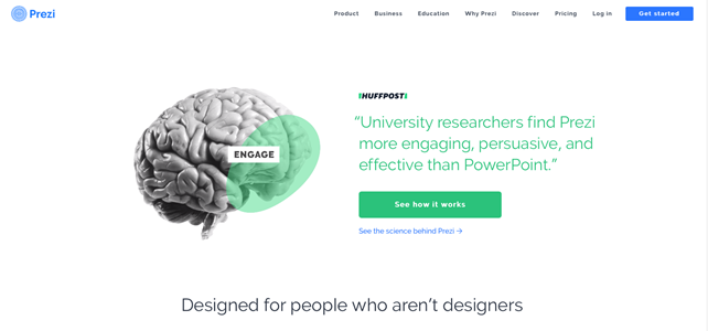
The overall design is done in black-&-white, so the green CTA looks stunning and noticeable. Also, the company stresses that you do not necessarily have to be a design guru to work with their product.
Make it short and clear
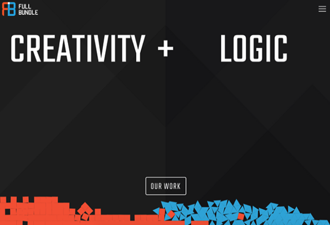
Have you ever seen a business that can use two words to create a powerful call to action? Full Bundle is confident that their“creativity” and “logic” will speak for themselves. Though the CTA button may look much smaller, “Our Work” is done in white so that it stands out from the rest of the dark elements. For such companies, their portfolio really matters, and they chose to include it in their CTA.
Highlight basic features
People might be interested in the features of your goods or service, but you should keep in mind that your competition is high. Thus, highlight things that make your business’s offering stand out from companies working in the same industry. That is how Apple successfully attracted customers from the very start of its iPod campaign. Skype, for example, decided to highlight the main benefits in several sentences in their heading.

Add a quick sign-up form
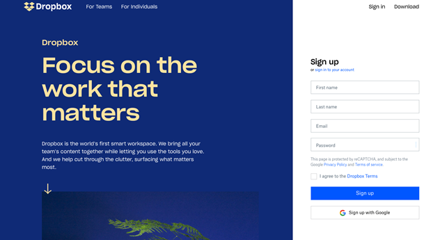
Dropbox is known as the world’s smartest workspace, which briefly and clearly states what they do and how their users can benefit from using their product. Then, they add a quick and convenient sign-up form where they also let users log in.
To boost the success of digital ads, and manage your sales funnel more effectively, use a call to action. Develop new approaches and remember the tried and true methods. Through experimentation and A/B testing, you’ll find the solution that is right for you!
References
- This article on HubSpot blog defines CTA and provides 31 call-to-Action examples. One can't help but click.
- This article offers 21 calls to action examples in writing and three rules for effective CTAs
- Here you'll find actionable actions on how to write effective CTAs.
- Get inspired by this list of examples of compelling CTAs.
or