A squeeze page is a web page made for capturing potential customers’ email addresses. It’s a common practice for these pages to offer free ebooks, educational emails, videos, and more, in exchange for a visitor’s email address or other data. At first sight, squeeze pages resemble landing pages, but they’re slightly different.
What is the difference between a squeeze page and a landing page?
In short, a squeeze page is a specific type of landing page; it’s made for one purpose – to collect users' email addresses. Apart from that, landing pages can aim at selling a product or service.
Typically, squeeze pages are shorter than landing pages. They contain a minimal amount of graphics, details, and additional information. Their task is to start a buyer's journey while landing pages work at different stages of the sales funnel.
A squeeze page can provide you with valuable leads. To nail it, optimize the page’s conversion rate from the beginning. Let’s unpack the several ways to compile a high-converting squeeze page.
As squeeze pages resemble landing pages, you can use some tips on building the latter as the foundation of your squeeze page. Our guide on boosting landing page conversions will come in handy. To deepen your knowledge of what makes a good squeeze page, read on to learn more about the best practices.
How to Create a High-Converting Squeeze Page
- Define the Right Target Audience
- Build an Appealing Offer
- Create a Killer Headline
- Think up a Great Design
- Create a Сlear Сall to Action
To leverage a good conversion rate, learn how to compose your squeeze page. We’ve picked five marketing, design, and copywriting tips to help you get started with your highly-converting page.
Define the Right Target Audience
To hook and retain your squeeze page visitors, you need to spot your audience precisely. Don’t content yourself with vague characteristics, such as “30-year-old women.” Find out your audience’s values, interests, and goals. You can extract more information from your customer profile. If you don’t have one, check our guide on compiling a buyer persona.
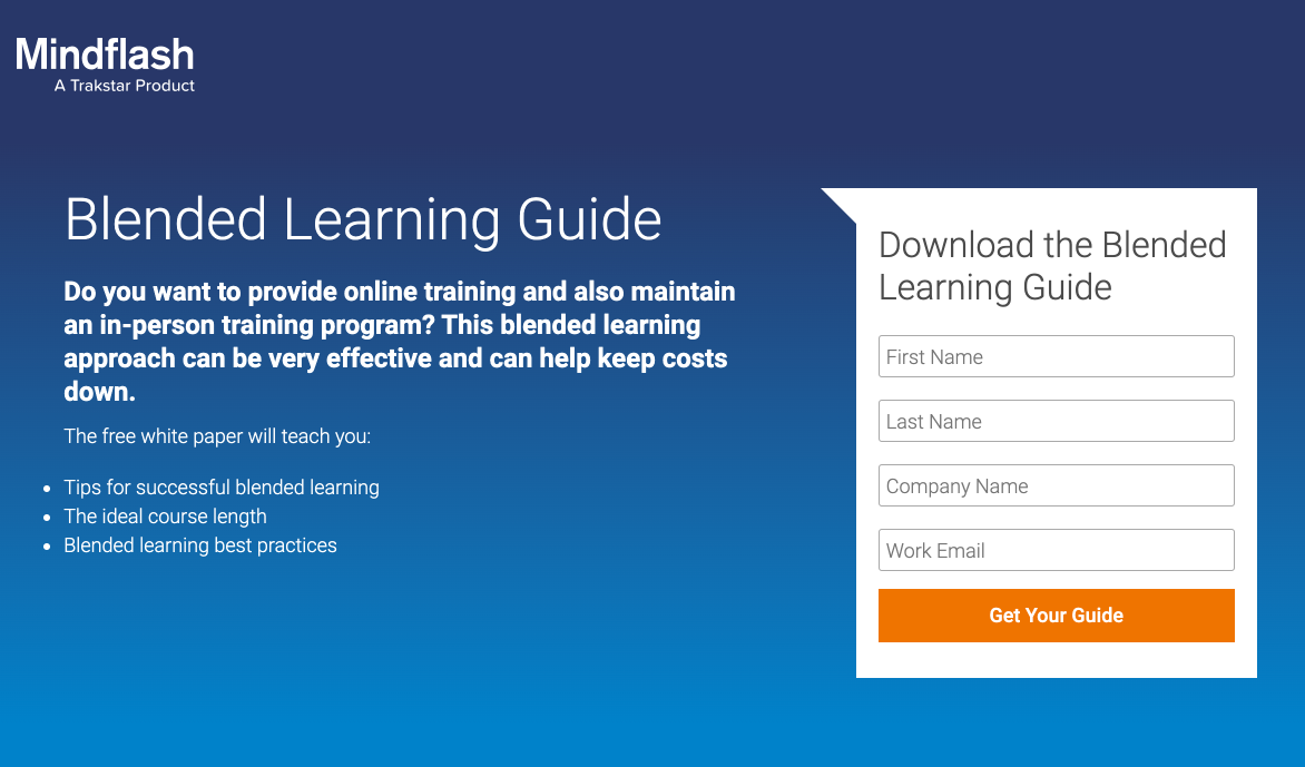
Address your visitors' pain points and interests, as Mindflash did in the example below. The company clearly stated its target audience – people eager to launch a training program. Moreover, Mindflash stressed the main advantage of their proposal. It helps customers build an effective program and keep the cost down.
Build an Appealing Offer
The key to success with a squeeze page is including a relevant and irresistible offer to your target audience. Usually, it is a lead magnet – PDF, report, checklist, or other types of useful downloadable content.
It might be tempting to give your visitors a monumental piece of content. But, don’t overdo it so as not to scare your audience away. Enormous books are intimidating; barely anyone got the whole way through War and Peace for this reason.
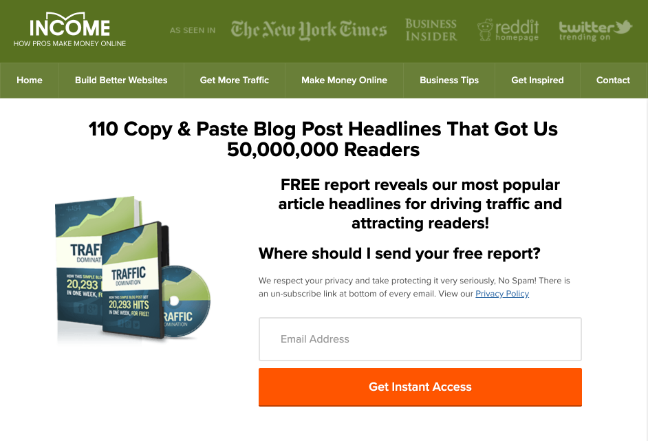
Give your audience something concise but valuable, as Incomediary does. The blog went for a compilation of 110 headlines that helped attract readers. This ebook is short and easy-to-use – just copy and paste the headlines.
Create a Killer Headline
By the way, take care of your squeeze page’s headline and supporting headings as well. These parts of any web page draw immediate user attention and can make or break further reading.
Here’re some tips on how to compose a headline that hooks attention:
- Address your reader’s pain points and offer a solution – your product.
- Indicate the product you are offering from the beginning.
- List the benefits a reader will get with your product, such as a conversion rate increase.
- Add figures – they’re clear-cut indicators of value.
Your supporting headings should relate to your headline perfectly. Otherwise, the whole work will fall flat, because it will confuse readers.
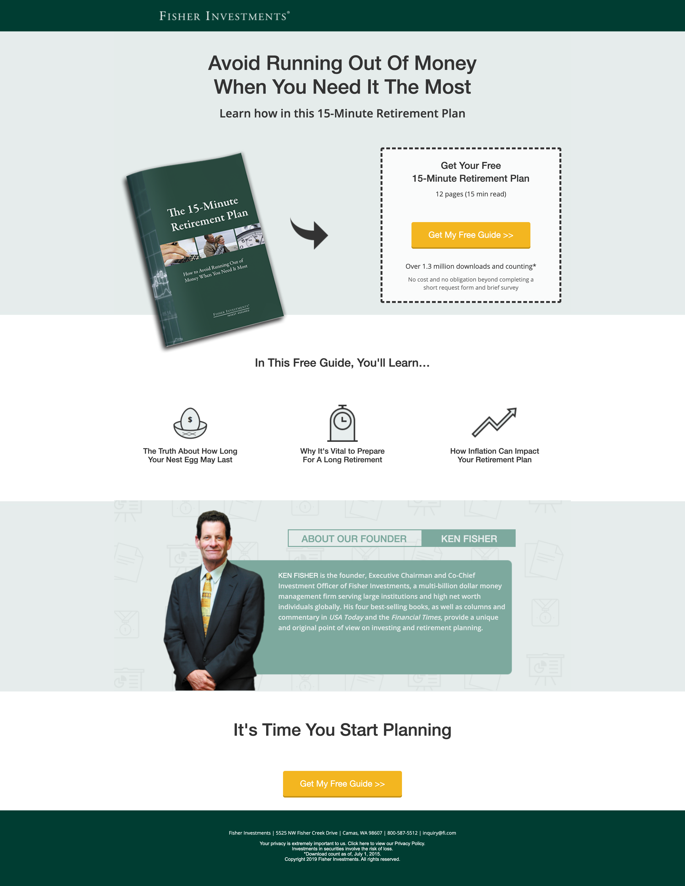
Look at the A+ squeeze page Fisher Investments provides. In the headline, the company addresses its audience’s fears of financial hardship. The supporting heading kills two birds with one stone; it gets to the bottom of the offer and highlights the simplicity of using this guide (just 15 minutes to read!).
Think up a Great Design
It takes a visitor only 50 milliseconds to decide whether a squeeze page is worth staying on or not. The page’s design is a golden opportunity to attract more readers and boost your conversion rate.
To create a stunning squeeze page, pay special attention to its structure; it should be crisp, airy, and easy to skim. Give some thought to color psychology; think of the association you want to create with your product and go for a matching shade. Finally, pick up the perfect visuals; images should be relevant, eye-catching, and high-quality.
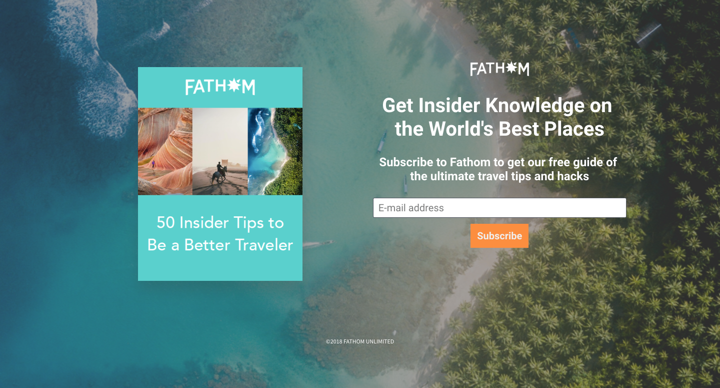
Here is an example from Fathom. To promote their travel guide, the company chose a background image with palm trees and a turquoise sea. This shot resembles the cover of the eBook on offer. The squeeze page has enough space between all the elements and looks airy. The color palette is unified and harmonic.
Create a Сlear Сall to Action
A call to action is a milestone for a high-converting squeeze page. Pay attention both to the design and the copy of your CTA button. For the visual part, use vibrant and contrasting colors and make sure the button is big enough for both desktop and mobile users to easily engage with. Leave some space around it and choose the right location (the best place is in the top left corner).
To drive conversions with the copy, go for a single clear-cut call to action. Pages with only one call to action convert 3% better than those with five or more links. To reinforce the message, use imperatives, such as “click” or “subscribe”.
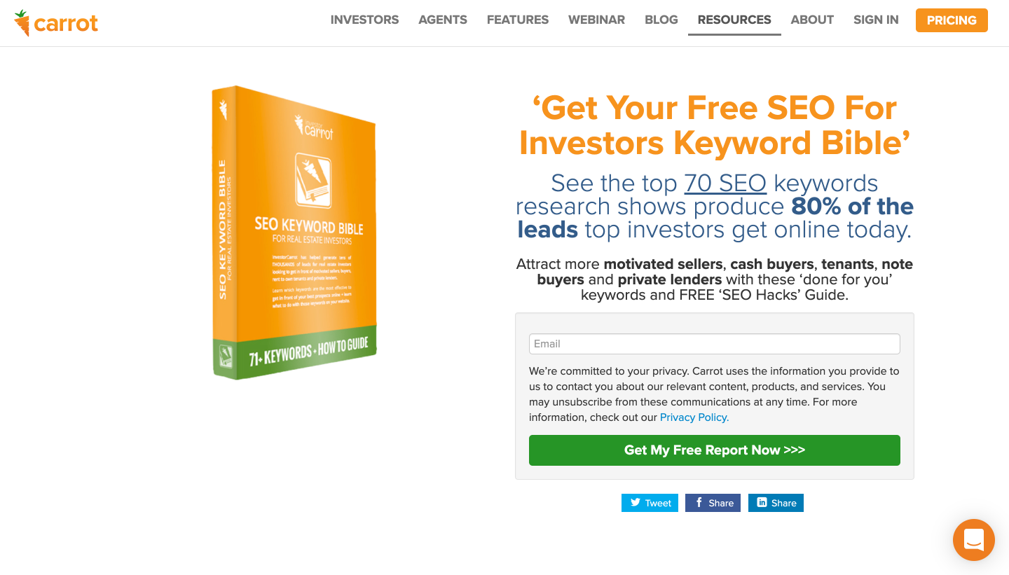
The lead generation service, Carrot, knows a thing or two about good calls to action. The CTA button is the same color as the bottom of the eBook cover; it creates symmetry and catches the viewer’s attention. The copy also works well being clear, imperative, and urgent by using the word “now.”
5 Squeeze Page Best Practices
- Go for Minimal Form Fields
- Use Multi-Channel Forms
- Make the Benefits Visible
- Include Social Proof
- Add Visuals Effectively
Practice makes perfect, so we’ve found five best practices brands stick to with their squeeze pages. We’ve also added some tips on implementing them into your strategy.
Go for Minimal Form Fields
You probably hate seeing the subscription forms with 5+ fields to fill in; so do your visitors. To get the maximum number of leads, minimize the number of form fields. The best option is to only ask for an email address or name and email address.
If you want to segment leads from a squeeze page, the email field alone is not enough. Give multi-step forms a shot. In other words, long forms split up into several pieces. Look at the example of such a form below.
At first, a viewer only sees a button and gets access to the form with five fields after a click. Thus, the process looks less intimidating, and a user is less likely to quit.
Use Multi-Channel Forms
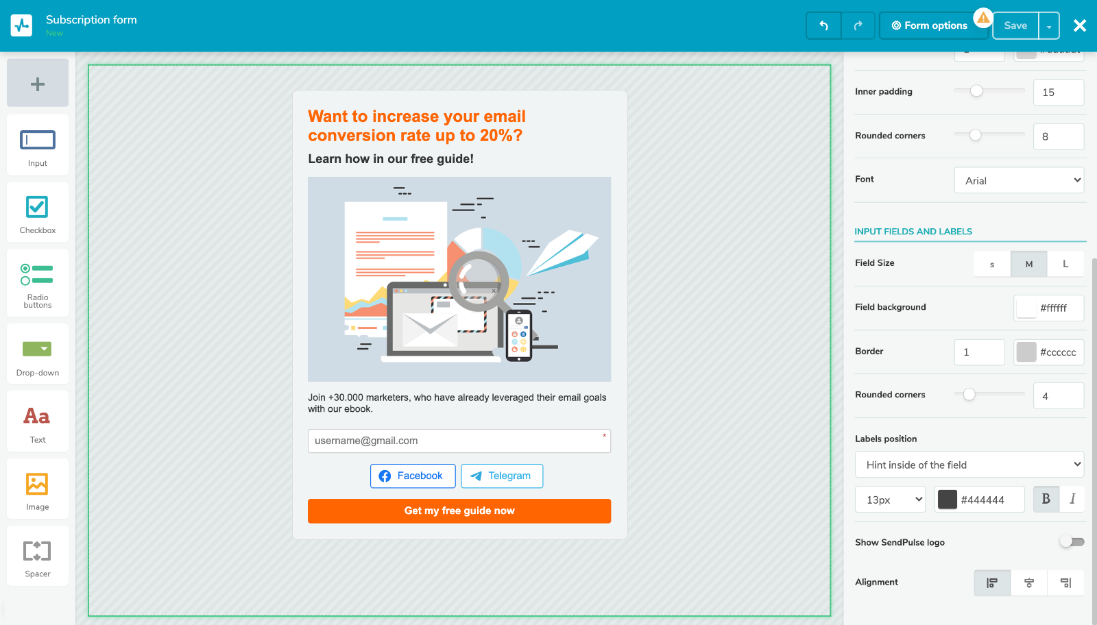
Our inboxes are overloaded. That makes it more difficult for your message to reach subscribers. Moreover, some users hardly ever use emails and spend most of their time on social media or messaging apps. The solution? Applying multi-channel forms. They allow visitors to subscribe with their email, messenger, or social media account.
To build beautiful, responsive, and adjustable multi-channel forms, try SendPulse. Below is an example of how it may look like. We’ve customized the form design and incorporated the buttons to subscribe to email and our Facebook and Telegram chatbots. Sign up with SendPulse and create as many forms as you like for free.
Make the Benefits Visible
It’s a good idea to list the advantages of your offer; this trick helps visitors make a decision. It’s even better to make these benefits more evident with icons, infographics, or images.
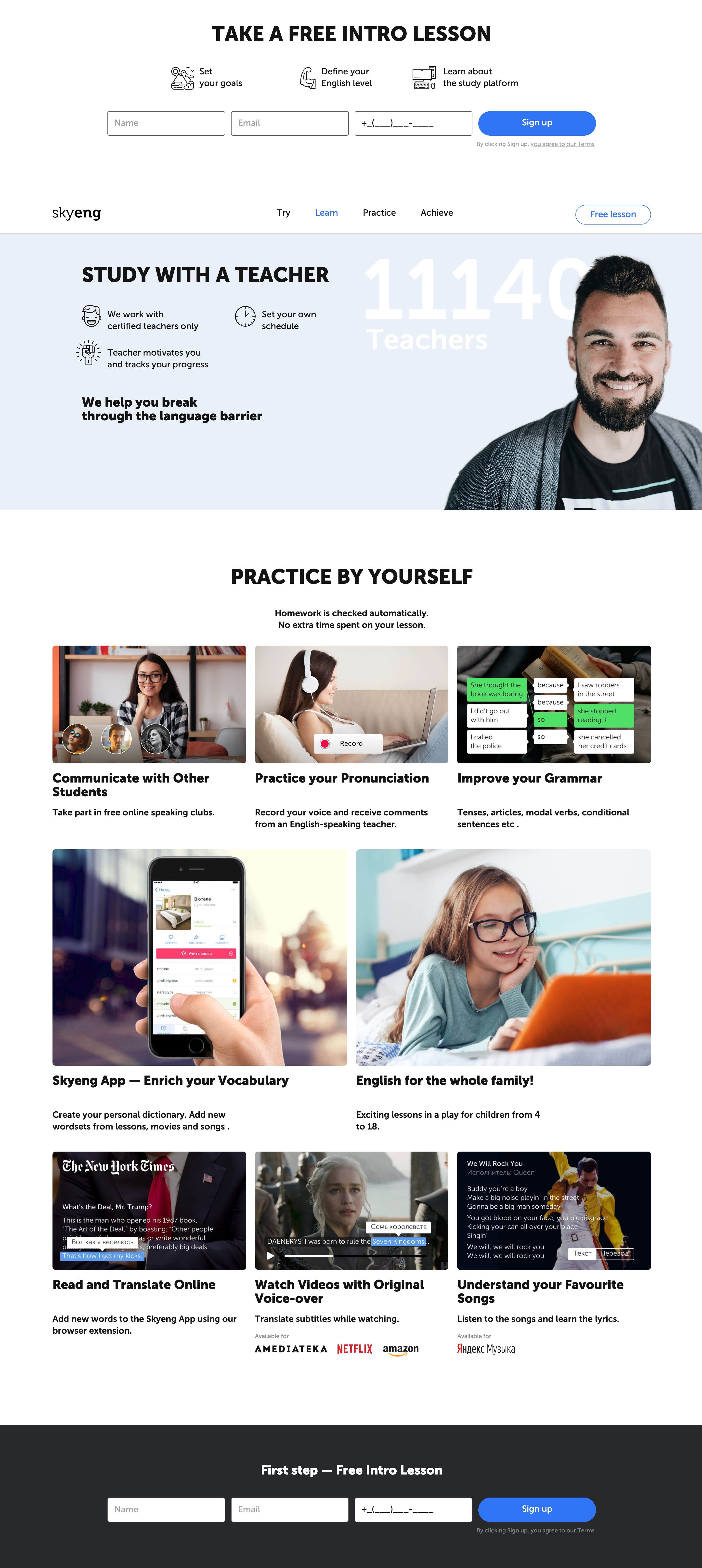
If your squeeze page offers a modest eBook or a newsletter, use icons instead. Make each of them unique and relevant to the advantage they illustrate. For a dose of inspiration, check out Skyeng's example. The company highlights the benefits of its product with custom pictures and screenshots.
Include Social Proof
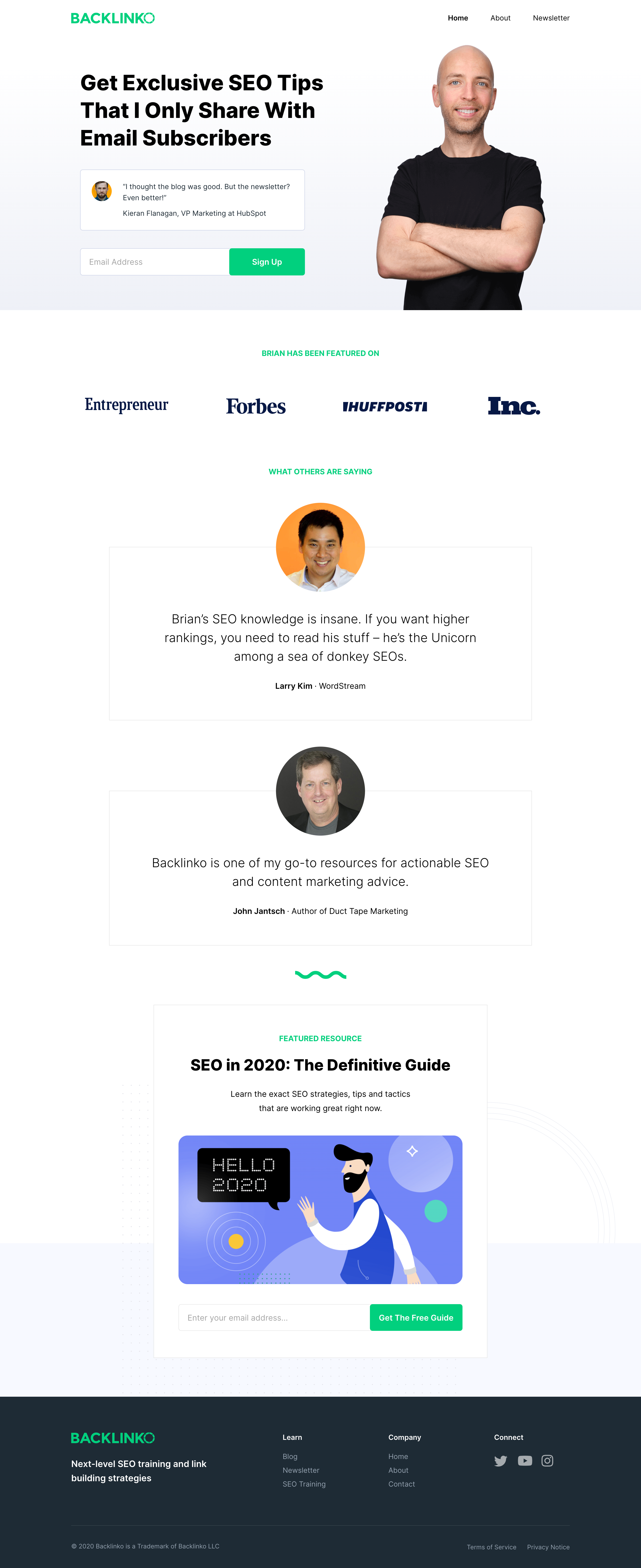
Social proof increases the credibility of your offer and the conversion rate as well. For instance, products with over 50 reviews have a 4.6% increase in conversion rates. It's an overwhelming amount for a squeeze page. However, even a couple of testimonials can make a difference.
To get your head around applying social proofs, consider following Backlinko's example. The company includes reviews both on the newsletter and the service itself. Moreover, Backlinko added the logos of media resources that have featured the brand.
Add Visuals Effectively
Visual content drives 84% more views and 94% more clicks than the text-only content. Thus, using visuals is a golden opportunity to boost your squeeze page views and conversion rate. To leverage it, the visuals should be relevant, high-quality, and attention-grabbing.
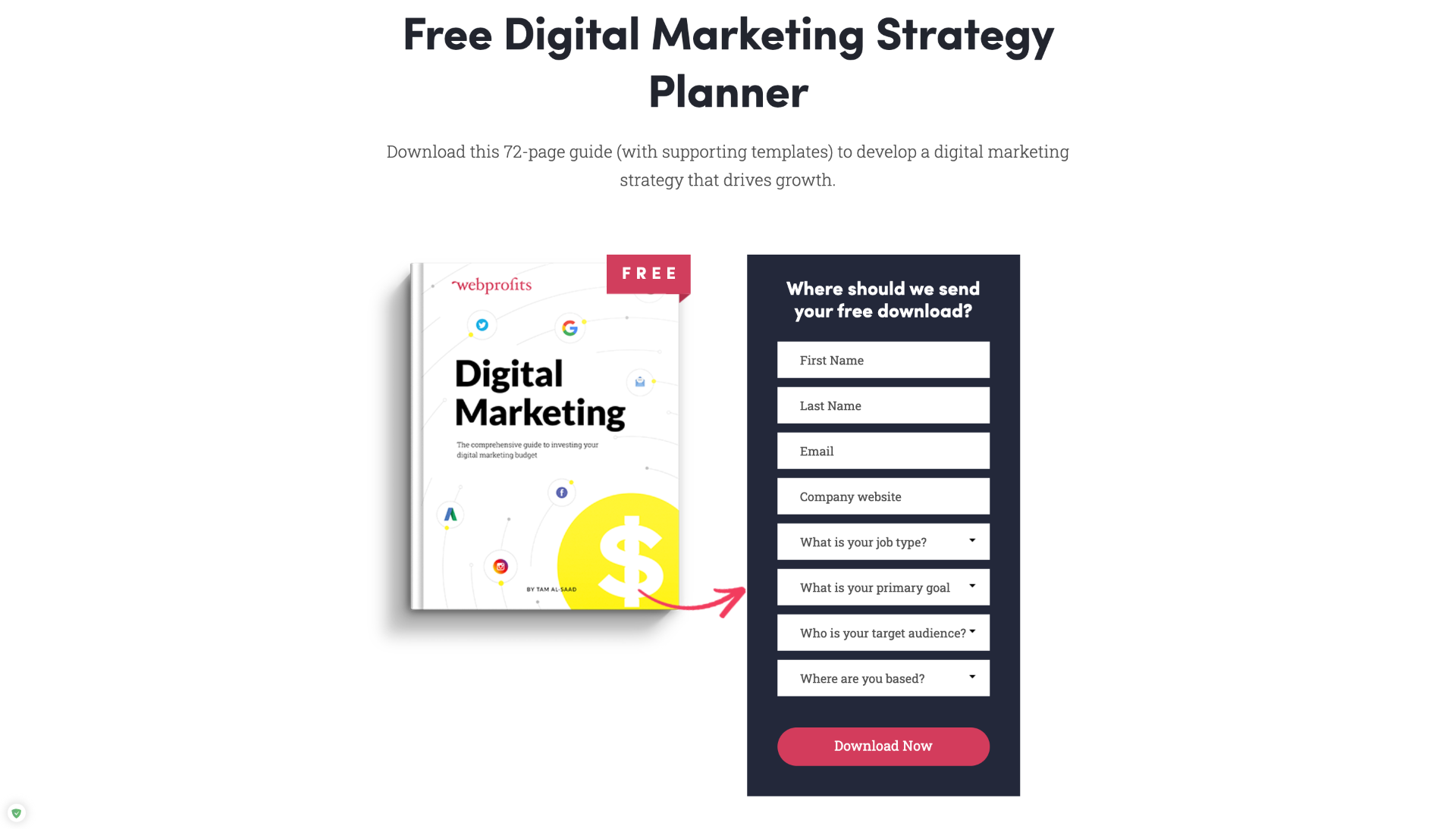
So, a win-win decision is to add product images, a guide, or an eBook to your offer. Look at this example from Webprofits. The company applied quality images to their guide, which looks like a new beautiful paper book.
If you want to go for something a little more creative, try adding a short video to your squeeze page. 83% of marketers say video content has helped them generate leads. You can apply a short overview of your product, reviews from happy customers, creative videos, and so on.
Eager for more practical information? Read and check out some more examples of a few squeeze pages we’ve picked for you.
4 Squeeze Page Examples
Examples are inspirational and helpful; they allow us to borrow the best and avoid the worst in our own approach. Let’s learn what other brands do right on their squeeze pages and what can be improved.
Pipedrive
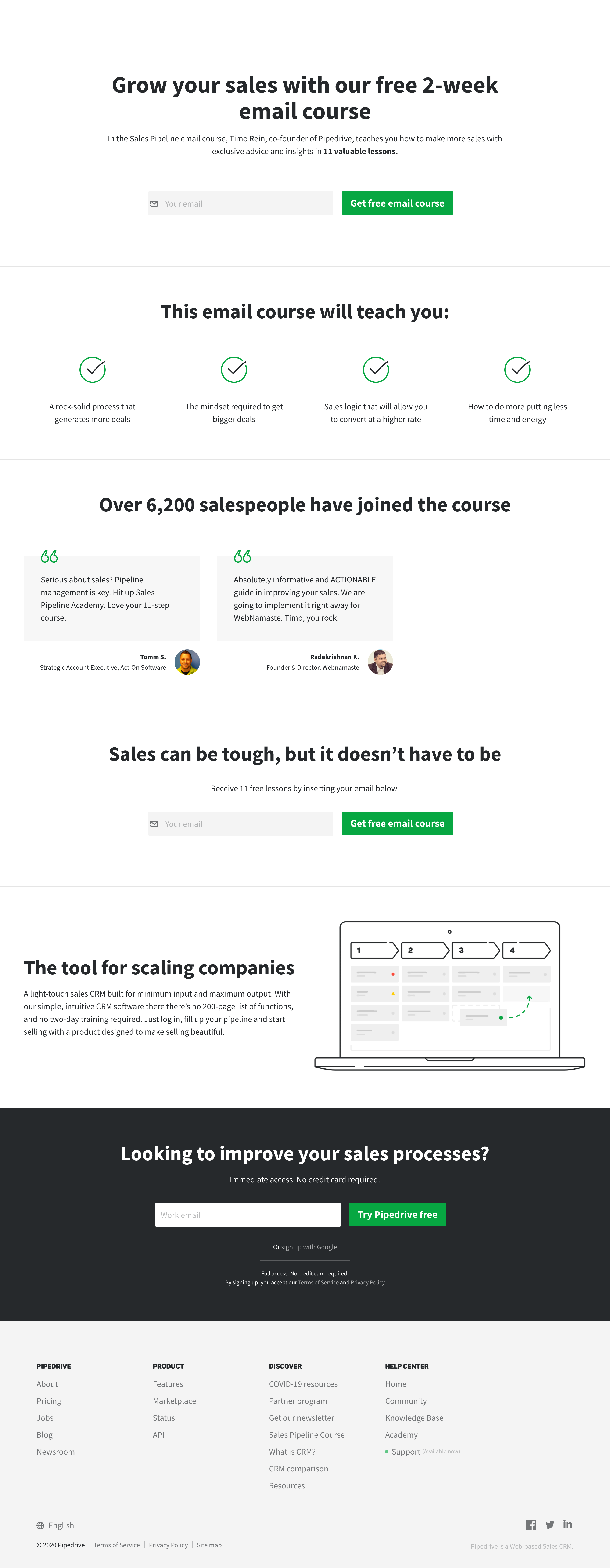
The software company, Pipedrive, shows a classic example of a well-made squeeze page. Offering free instructional emails, Pipedrive highlights its advantages.
Its minimal sharp design works well for this page. The company uses three colors, which makes the green CTA button stand out. The copy is concise yet persuasive. The subscription form is simple, which works best for a squeeze page.
The best part of this page is that it includes social proof. Pipedrive added reviews from real people with their photos and occupations. This move makes the credibility of the product skyrocket. To reinforce this effect, the company shows the number of course subscribers.
Rosetta Stone
The education technology service, Rosetta Stone, knows a thing or two about using visuals. The company chose vibrant colors for the squeeze page in the example below. Better yet, it uses animated images of its product – the language learning app. This way, Rosetta Stone kills two birds with one stone; it shows the product and stresses the benefits of using it for the audience.
The work with social proof is excellent as well. The company subtly interweaves reviews, clients’ logos, and statistics into its squeeze page.
The page may seem a bit overloaded, especially contrasting with the previous example. Nevertheless, the CTA buttons are noticeable. Although there is some space for improvement, the copy works well.
Summit in a box
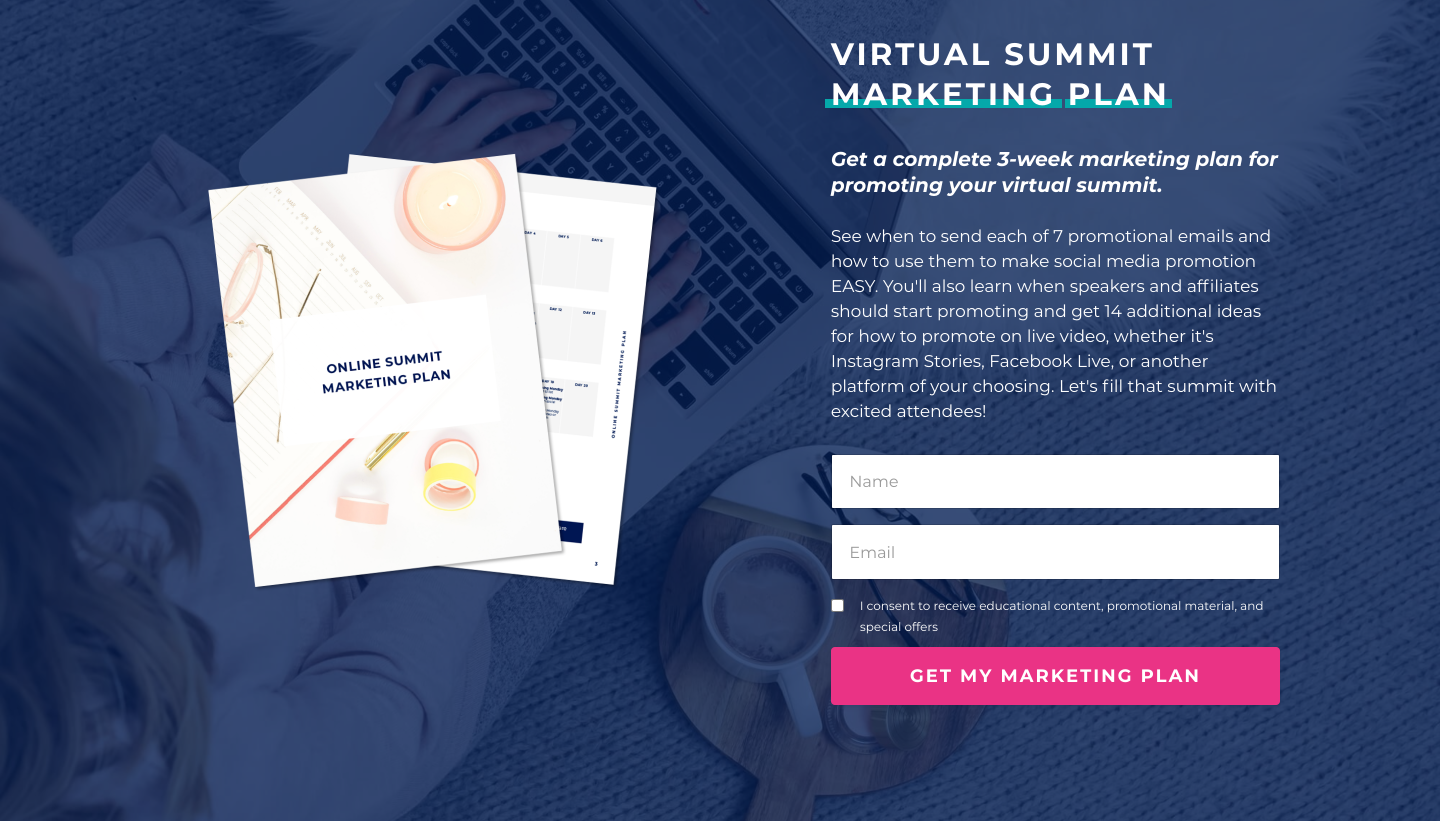
The virtual summit system, Summit in a Box, nails its squeeze page with an appealing offer. The company provides subscribers with a marketing plan for their summit. The eBook includes instructions on email and social media promotion for webinar coordinators and speakers. This guide looks so easy-to-apply and handy, that you instantly want to get it.
Summit in a Box seems to cut corners with this copy; it needs a sharper structure. The benefits of the eBook would look better as a bulleted list.
The visual part of the page is easy-on-the-eyes. The image of the product is nice, and the background doesn’t make the copy illegible. The CTA button is eye-catching, and the form is concise.
TapInfluence
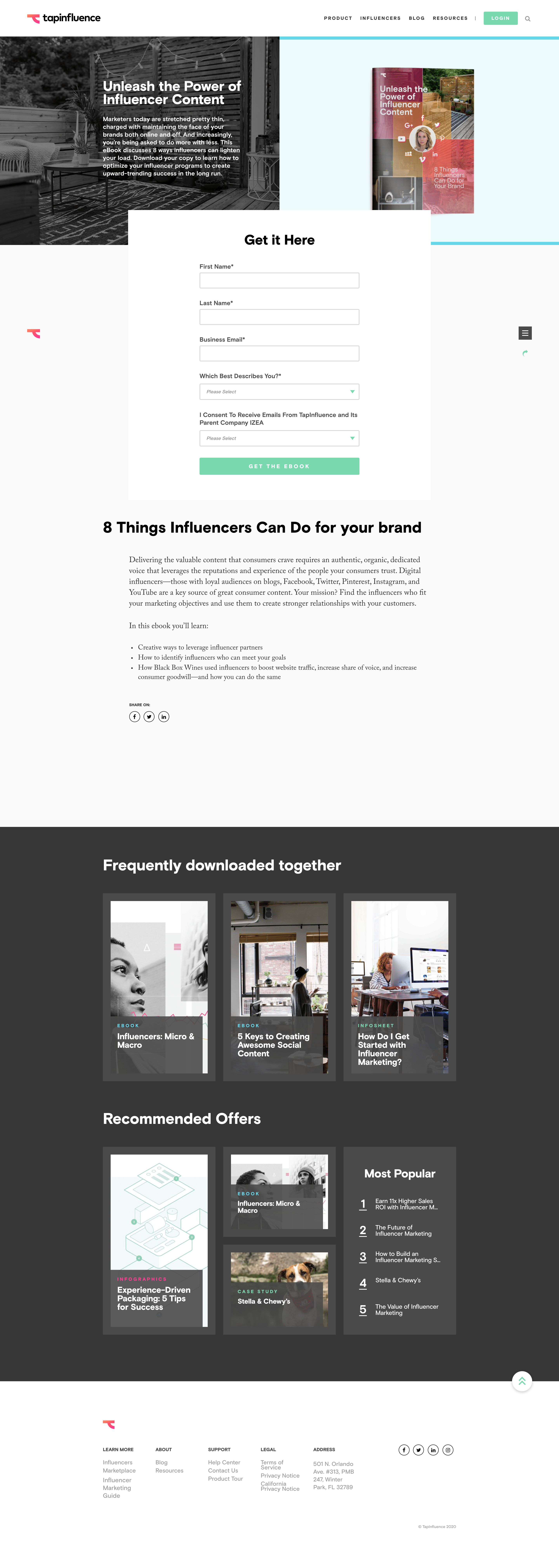
Influencer marketing service, TapInfluence, has staked almost everything on a sophisticated design. The company went for a flashy header on its squeeze page. One half of it shows the eBook the service offers, and the other reflects a part of the cover.
The CTA button is visible, although it’s not so bright. TapInfluence could have reduced the number of fields or gone for a multi-part form. Nevertheless, the subscription process doesn’t look intimidating.
Another advantage of this page is its copy. It starts with addressing the audience’s pain points and offering a solution – the eBook. Further, you can see a brief description of the guide’s content and the list of benefits you can get from it.
We have unpacked a few hacks and examples of creating high-converting squeeze pages. To maintain communication with leads from them, consider email marketing, or reinforce your lead strategy with SMS, messenger chatbots, and web push notifications. Sign up with SendPulse to benefit from implementing these tools into your marketing strategy.

or