The Column element in website builder
The Column element allows you to place widgets vertically. You can add up to 6 columns in one row for each section.
Add a column
Hover over the left or right border of an element, and click + (Add Column) to add a column.

Customize your column
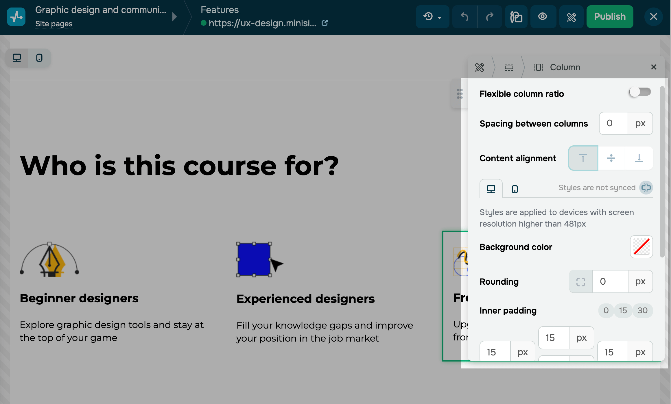
By default, styles are synced across all device versions. To customize each version separately, turn off Styles are synced.
You can customize the following column settings:
| Flexible content ratio | When you activate this setting, you can manually adjust your column’s width. If you increase the width of one column, the others will shrink proportionally along with their content. |
| Spacing between columns | Adds external spacing between columns. |
| Content alignment | Aligns widget content vertically within a column. You can pin it at the top, middle, or bottom. |
| Background color | Changes a column’s background color. Click the icon and select a color.
To avoid covering the block’s background color, you can set the value to Transparent. |
| Rounding | Rounds column corners. The higher the value, the rounder the corners.
To see the rounding effect, select a column background color. |
| Inner padding | Adds padding between the column’s edge and the widget. Select preset values, or enter your own for the top, bottom, left, and right padding. |
| Background image | Sets a background image instead of a background color. Turn on the toggle and select an image. |
| Contour | Adds a border around the column to highlight its edges. Turn on the toggle, set a contour thickness in pixels, and select a line type, color, and rounding. |
| Shadow | Adds a shadow around the column to make it stand out. |
| Animation | Adds animation to column elements. Turn on the toggle, and select an animation type, direction, and speed. |
Last Updated: 18.07.2025
or