Adjust your mobile website version
Adjusting your mobile website version can help you ensure seamless user navigation, boost user experience, and increase conversions. SendPulse’s website builder generates a mobile version of your website automatically, but you can edit its elements, columns, sections, and blocks separately from your desktop version.
Let's talk about how to adjust your mobile website version.
Element settings
It is best to adjust your mobile website version’s element sizes and alignment to ensure optimal display on mobile devices.
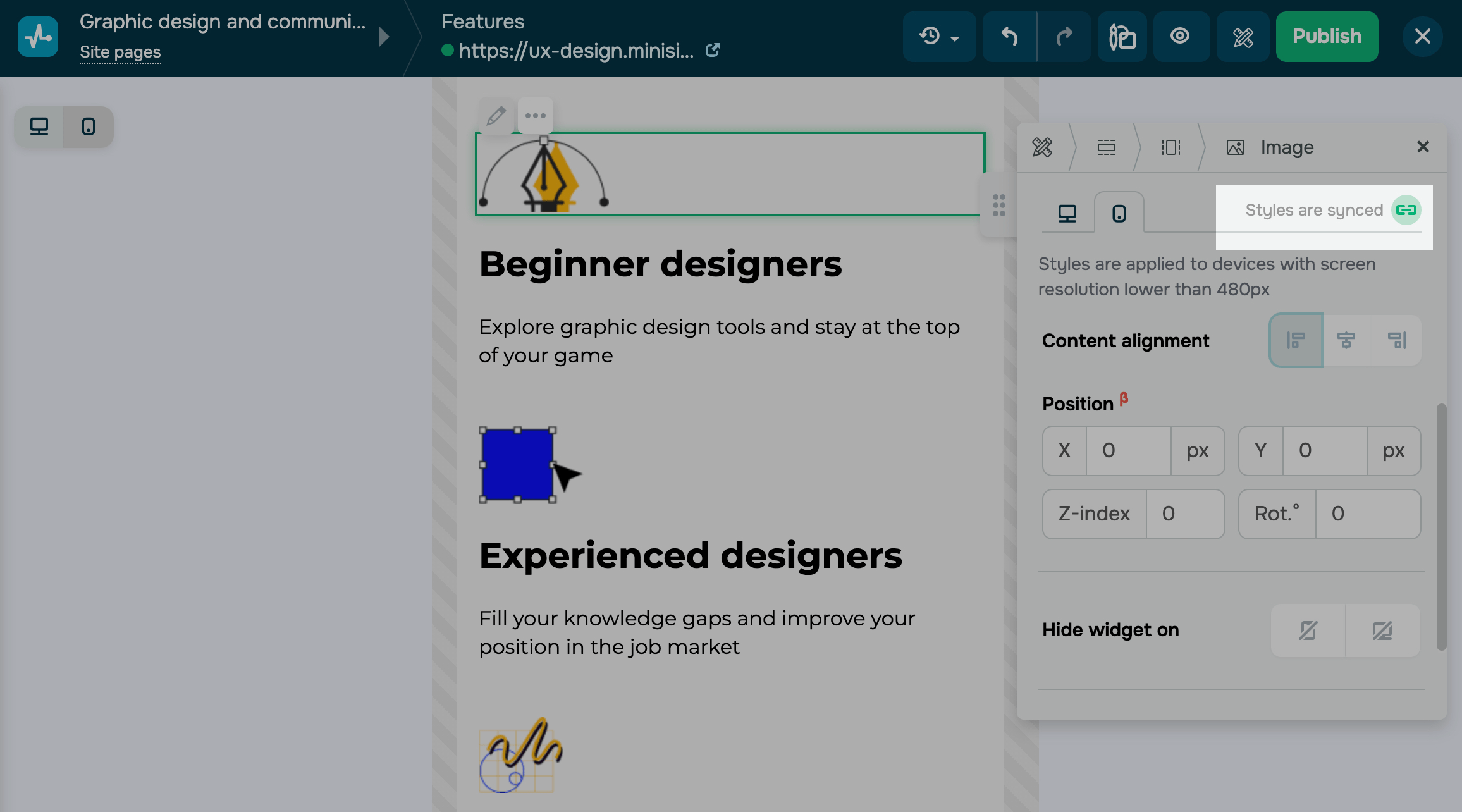
By default, your page design is responsive. All the style settings of your desktop website version are synchronized and adjusted to your mobile version.
In an element's settings panel, switch to your mobile website version, and disable version synchronization.
Styles are applicable to devices with a screen resolution lower than 481px.
Depending on the element, you can edit its alignment (left, right, or center), height, padding, rounding, background color, and background image.
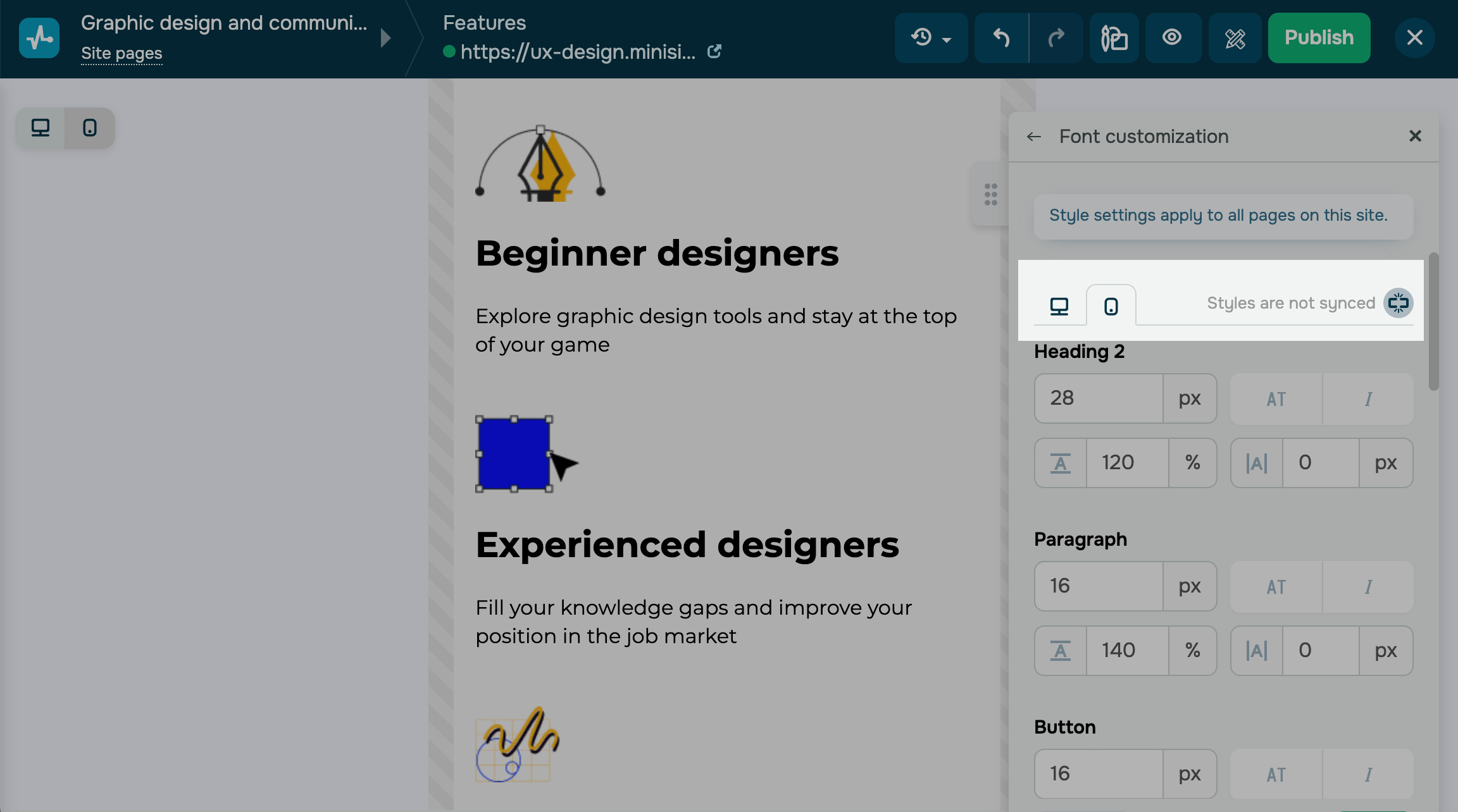
Font settings
To edit your mobile version fonts, go to your website styles, and click Customize next to your fonts.
Click the icon to disable synchronization, and customize your fonts.
You can customize your heading, body text, and button text styles.
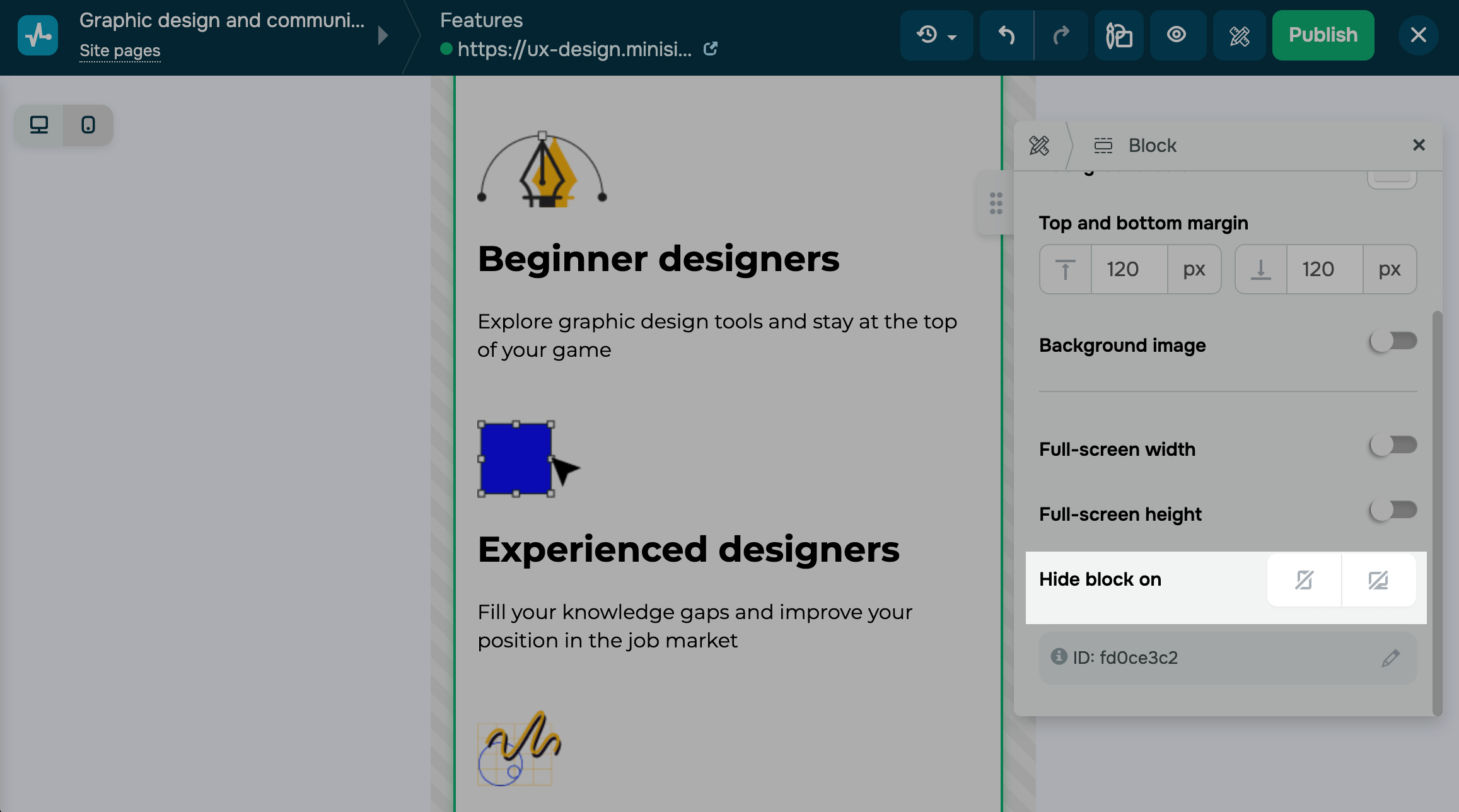
Hiding blocks
You can hide a block on mobile devices to optimize content display, improve your page load speed, and improve user experience on smaller screens.
To hide a block with all its elements, go to the block settings, and in the Hide block on field, select the desktop or mobile icon.
To hide only a widget, go to the widget settings, and in the Hide widget on field, select the desktop or mobile icon.
You can preview your adjusted mobile website version and compare it to the desktop one using the switcher in the upper left corner.
Last Updated: 28.10.2024
or